Moon Store
UI design | Interaction design
2023
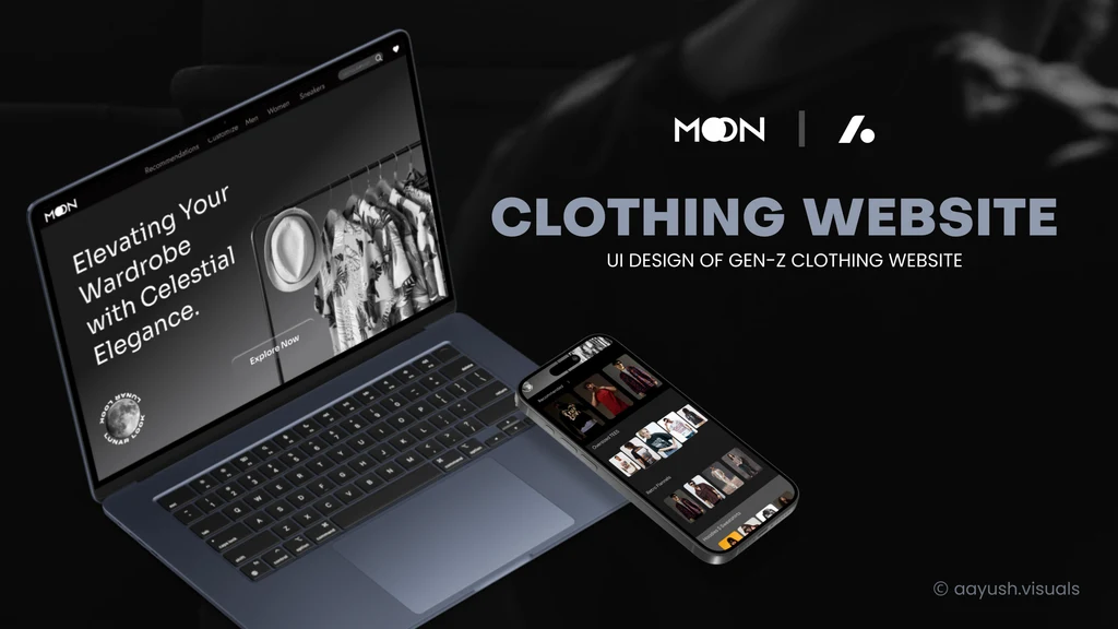
Moon Store is a high-end fashion storefront for a Gen-Z shopper, with a configurator, LunarLook, that lets you choose a garment's fabric, quality and style before you buy. I designed the web and mobile UI around a single photograph of the moon.
Services:
Challenge:
Luxury on a label with no luxury budget, and a factory inside a shopping flow.
Role:
UI Designer
01
About
Luxury the brand could not buy had to come from restraint, so one photograph of the moon carries the whole store.
Gen-Z fashion storefronts all resolve to the same page, a grid of products on white. The brief wanted luxury and exclusivity from a label with none of a luxury house's budget.
And the differentiator was customisation, the hardest thing to fit inside a shopping flow: fabric, GSM and manufacture are factory questions asked of somebody who just wants a t-shirt.
02
Details
- Brand
- Moon
- Scope
- Web and mobile UI
- Typefaces
- Sora, Krona One
Challenge
Seven routes, men, women, sneakers, oversized tees, retro flannels, hoodies and sweatshirts, lead into one catalogue, and a shopper who cannot find their aisle on the first screen leaves.
Solution
One photograph carries the whole brand. The moon sits behind login, bag, payment and shipping, on near-black at the same scale every time, and a three-value palette leaves the product photography as the only colour in the room.
LunarLook is a form, not a factory. Five questions on one screen, fabric, manufacture, quality, GSM and style, then a separate Customise step for artwork, colour and size, so manufacturing decisions never interrupt the buy.
Krona One sets only section titles and Sora carries everything a shopper reads. That contrast is what makes a three-colour page feel designed rather than unfinished.
03
The full case study


Keep exploring