

Association of Indian Universities
Visual branding | Graphic design
2024
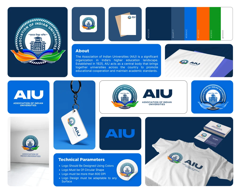
The Association of Indian Universities has brought Indian universities together since 1925. I redesigned its seal for everywhere it now has to appear, keeping the architecture and symbolism and giving it the weight to survive as a favicon as well as a stamp.
Services:
Challenge:
A century-old seal that only works at the size it was drawn.
Role:
Brand Designer
01
About
A century-old seal cannot be swapped for something fashionable, so I kept everything and changed its weight.
The existing mark is a line drawing: fine strokes, a full circle of type and detail that only survives at the size it was drawn. On a small avatar it loses its centre entirely.
The tricolour, the open book, the graduation cap and the Sanskrit motto all had to stay, and all had to stay legible.
02
Details
- Client
- Association of Indian Universities
- Founded
- 1925
- Scope
- Logo redesign and identity
Challenge
It has to hold on a degree certificate, a letterhead, a keychain and a 25px avatar, without losing any of the symbolism that makes it the AIU's own.
Solution
Weight, not simplification. The seal keeps its ring of type, the building and the open book, and gains the mass to hold together small or printed in one colour.
A floor I measured rather than asserted. I set the mark out at 100, 50, 30 and 25px and named 25px as the minimum; below 35px it starts losing its identity, so the guidance says to stay above that.
Six values, each carrying meaning: deep blue for wisdom, stability and trust, and the tricolour's orange, white and green beneath the open book, supporting the motto, एकता विद्या शक्ति, rather than decorating it.
03
The full case study


Keep exploring