

IP&TT Cell
One pillar that spells I, P and TT, for the cell that turns university research into patents
- RoleBrand Identity
- Year2026
- ToolsFigma

(01)
(About)
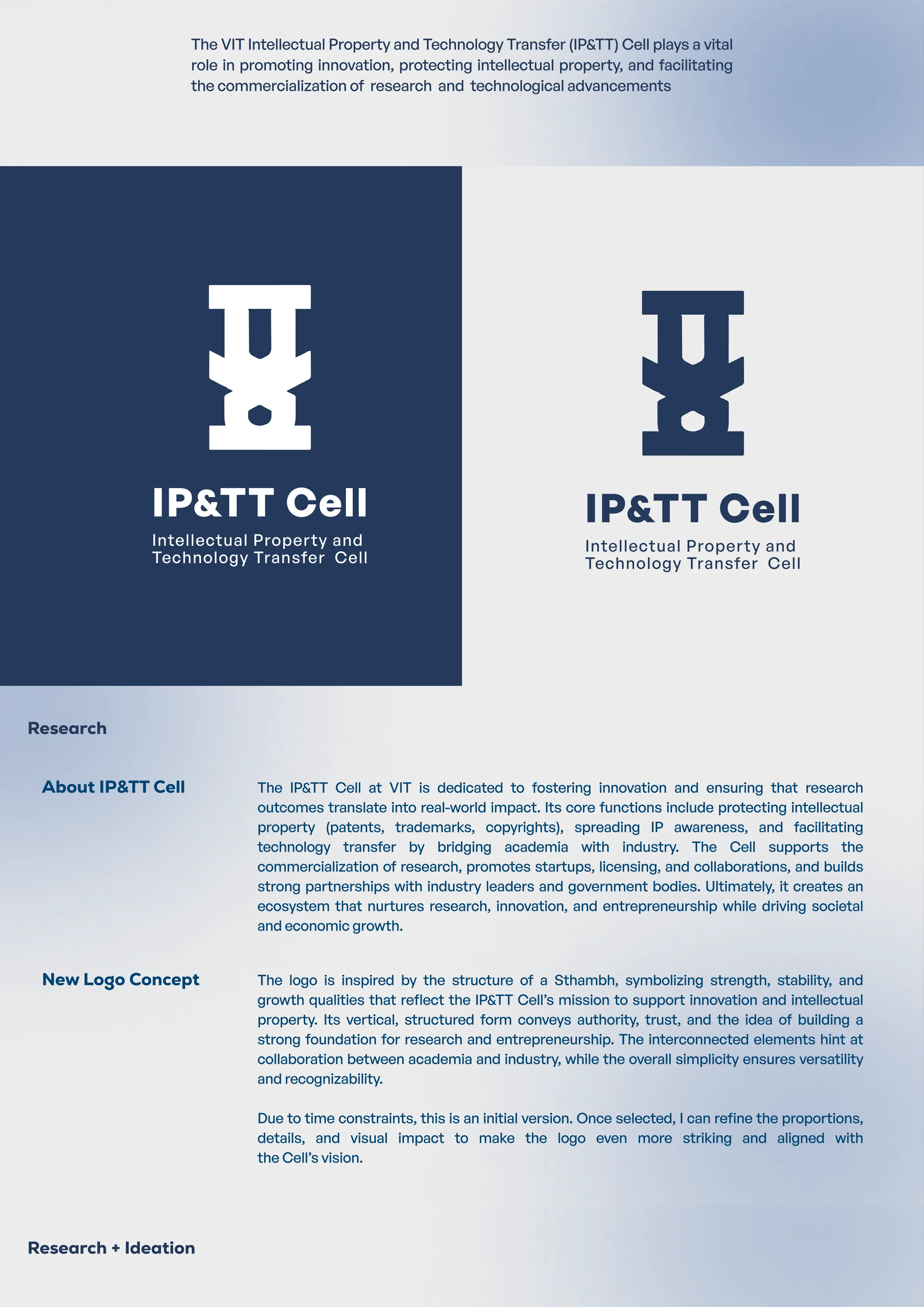
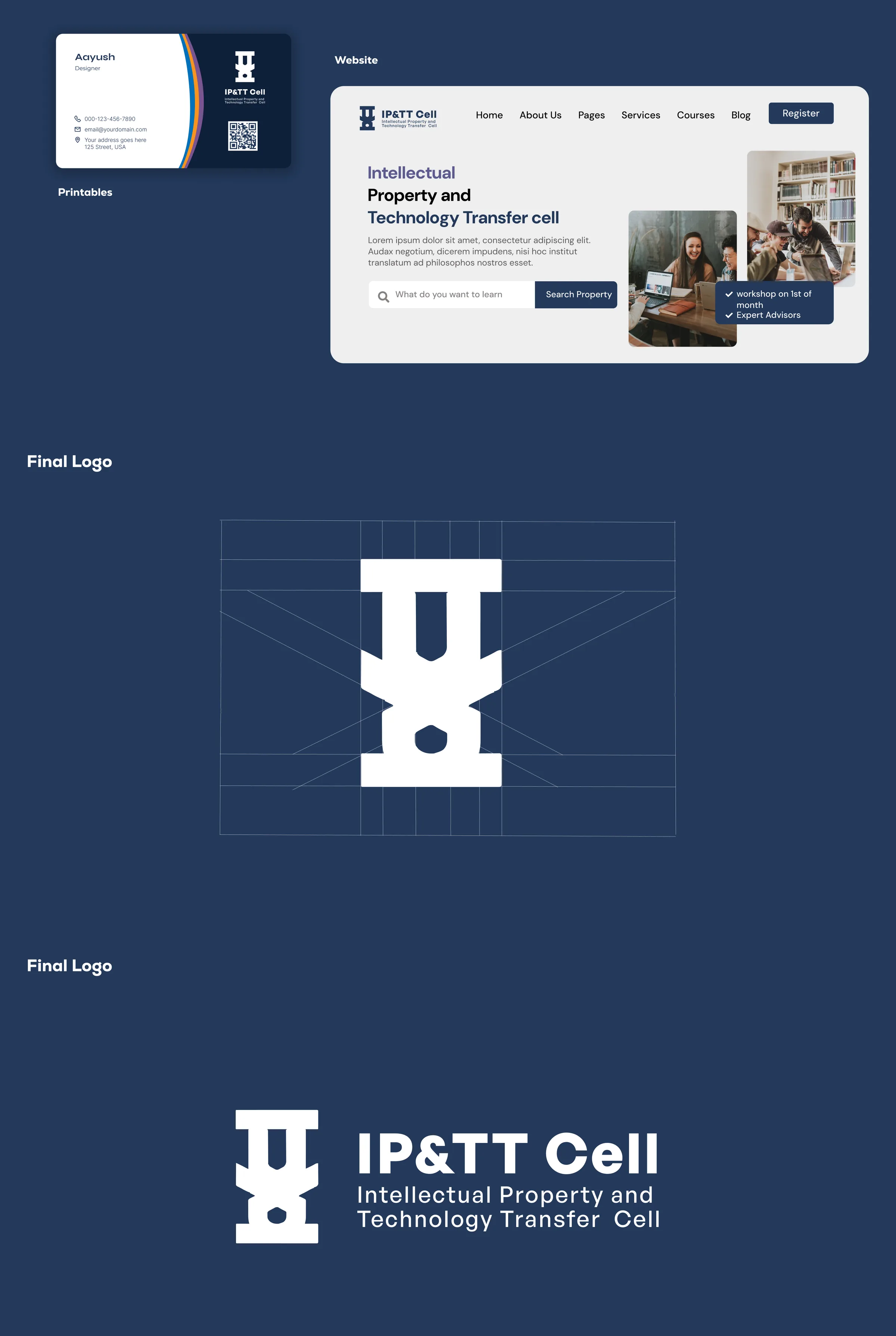
VIT's Intellectual Property and Technology Transfer Cell protects what the university invents and gets it into industry. The identity is a single pillar built out of the letters I, P and TT - a Sthambh, for the strength and foundation the Cell exists to give research.
(02)
(Details)
- Client
- IP&TT Cell, VIT Vellore
- Scope
- Logo and identity direction
- Stage
- First round, for selection
(Challenge)
The name is the problem. Intellectual Property and Technology Transfer Cell is five words nobody reads twice, and whatever replaces them has to hold at the size of a favicon and at the size of a building sign.
It faces two audiences who trust different things: researchers inside the university and industry outside it. A mark that reads as a student society to one, or as a law firm to the other, loses the half it was meant to convince.
And it was a first round against a deadline, so the form had to be settled before the detail was. A mark that is only right once it is finished cannot be reviewed.
(Solution)
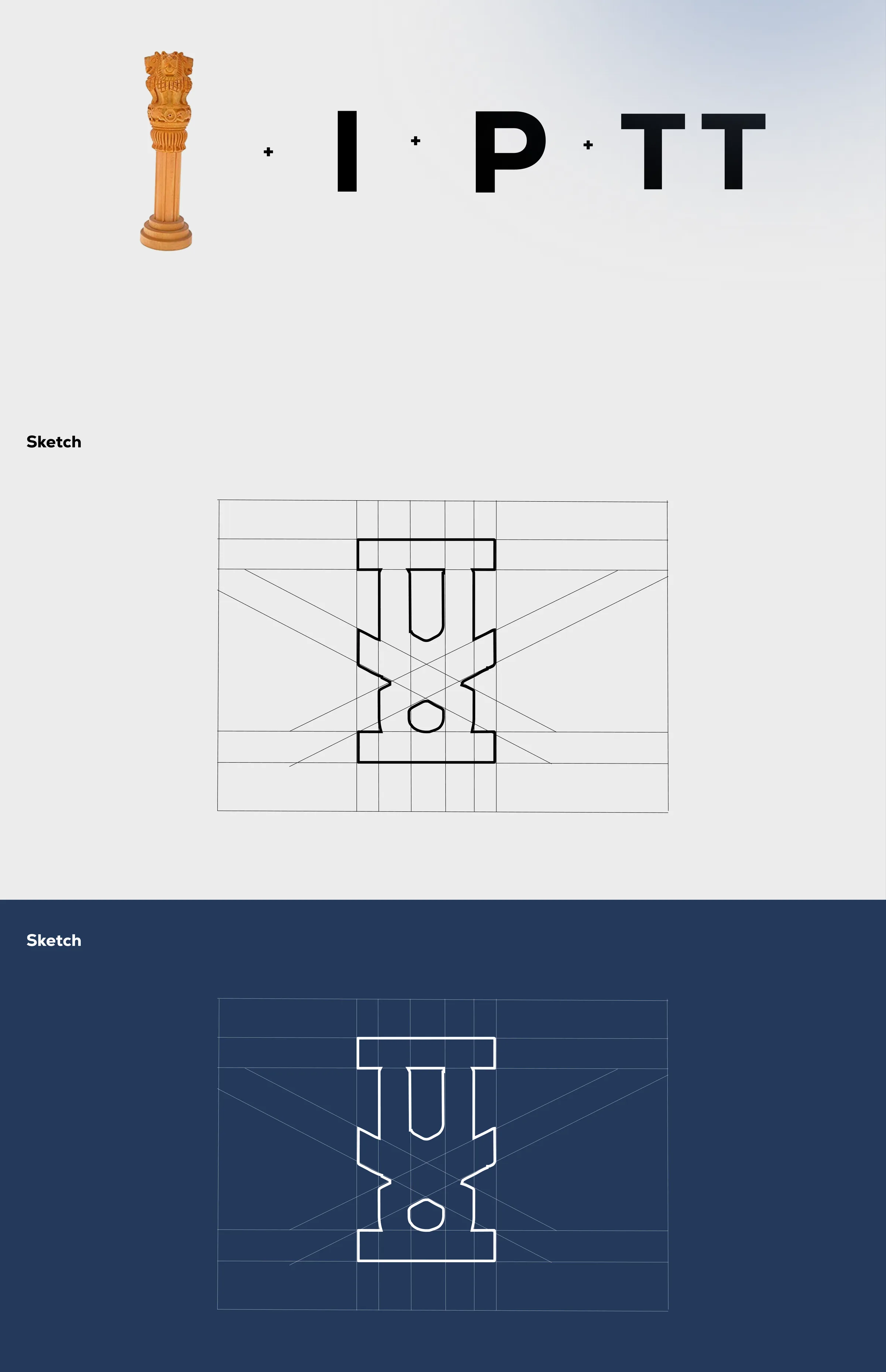
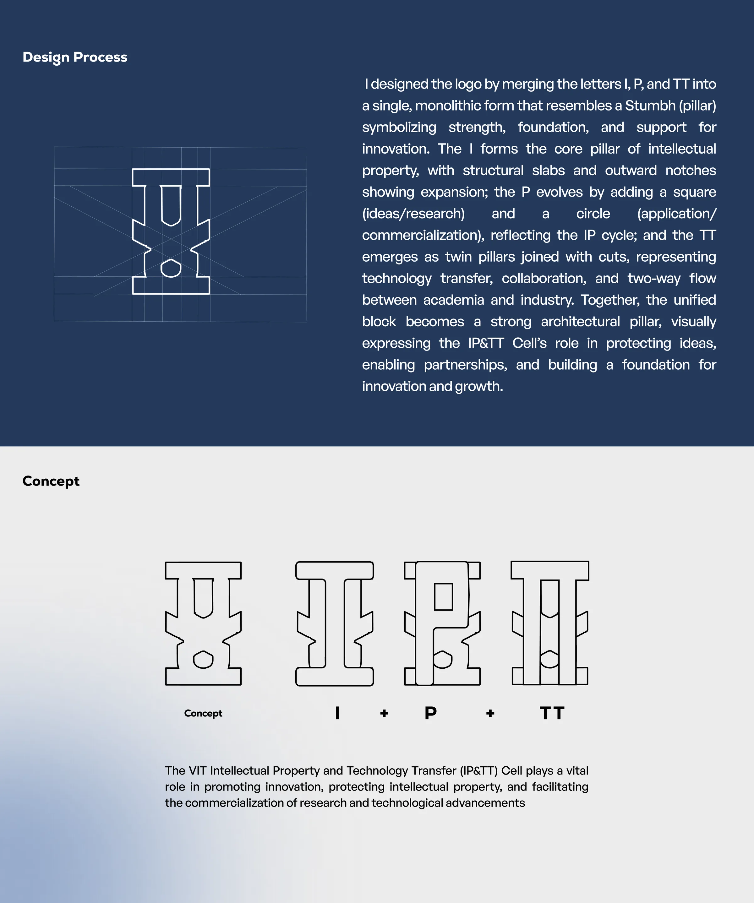
One monolithic form, not a monogram. I, P and TT are merged into a single Sthambh - a pillar - so the acronym is the shape rather than four letters standing next to each other. The vertical, structured mass is where the authority comes from.
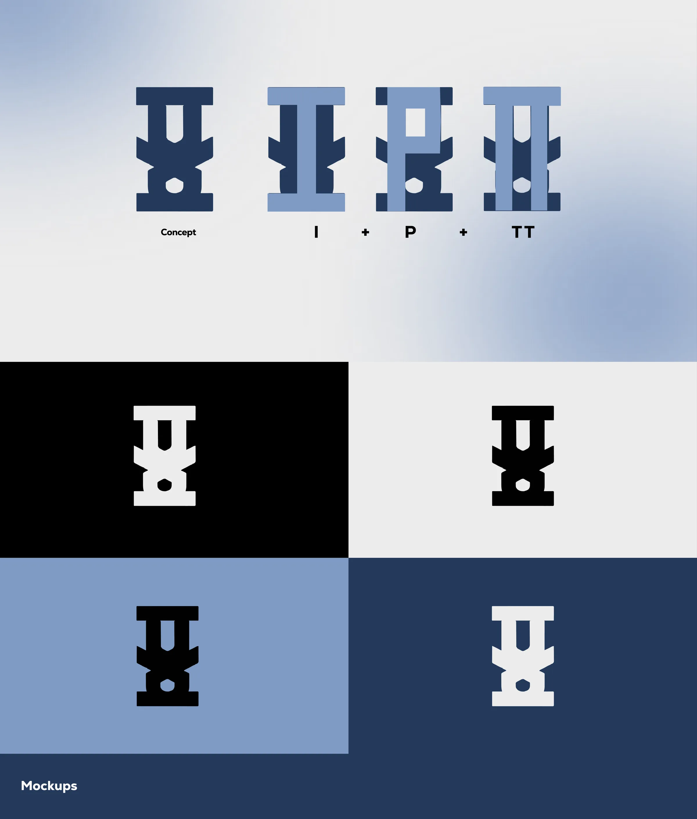
The IP cycle is built into the letterform. The I is the core pillar, with structural slabs and outward notches for expansion. The P gains a square for ideas and research and a circle for application and commercialisation. The TT resolves as twin pillars joined by cuts: technology transfer, and the two-way flow between academia and industry.
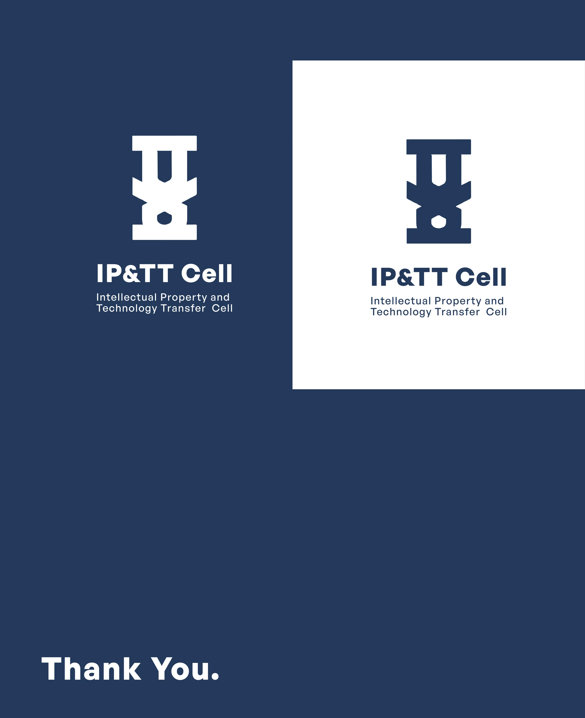
Proved as a solid before it was a lockup. Drawn on a construction grid, then set on black, light grey, mid blue and the brand navy, so versatility was tested rather than assumed. The lockups came last.
(03)
(The full case study)

(04)
(More Work)

Got something in mind?
A job, a project, a wild idea. Whatever it is, drop me a message. Let’s see what we can make out of it.
- Looking for my next opportunity
- Open to freelance work
- Always happy to talk design