

CPGRAMS
Filing a government grievance by speaking, in any of 22 languages
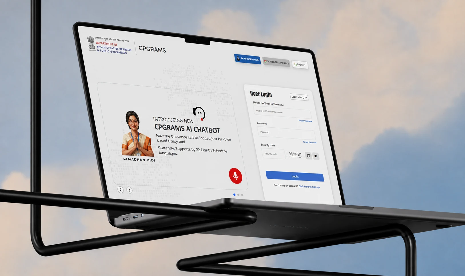
CPGRAMS is how you complain to the Government of India: twenty lakh grievances a year, more than ninety ministries, and a fifteen-field form that in practice only works if you read English or Hindi. I designed the chatbot that sits on top of it, so you can say what went wrong in whichever of the 22 official languages you actually think in, and it files the grievance for you.
- RoleProduct Designer · Conversational UX
- Year2026
- ToolsFigma, Conversational UX, Prototyping
(01)
(About)
A channel built for 1.4 billion people, used in practice by the top 15%.
Complaining to your own government should be the easiest thing you ever do online. It is a right, it is written down, and somebody at the other end is obliged to answer. In practice it has been closer to a qualification test.
So this was never really a chatbot project. It was a project about who gets to be heard, and the interface was just where that got decided.
(02)
(Details)
- Client
- DARPG, Government of India
- Delivered with
- KPMG India
- Languages
- 22 scheduled Indian languages
- Scope
- Conversational architecture, voice UX, UI, mascot, design system
- Surfaces
- Web chatbot, mobile web
- Live at
- cpgramsaichatbot.com
(Challenge)
The system works. The door does not. Anyone can lodge a complaint against any central department, an officer is legally obliged to answer it, and 93% of the twenty lakh filed each year get closed. That machinery is real.
Getting to it is the problem. There is a 15-field form, and its second question asks which of 90+ ministries owns what happened to you. That is a filing decision, demanded before you have described anything. Add English or Hindi only, a desktop-shaped layout, a CAPTCHA and a session that quietly expires, and six in ten people who start the form never finish it.
Which means the people the system exists for are the ones least able to reach it. A quarter of the country cannot read or write. More than 550 million citizens think in a language the portal does not speak.
(Solution)
Work out the ministry instead of asking for it. Listen for the language instead of offering a list. And show the person what you understood before anything is filed.
That turned the job from redesigning the portal into building a translation layer over it. Same ministries, same categories, same 30 to 60 day clock. The complexity does not disappear, it moves off the citizen and into the software, which already knows how government is organised.
Voice carries it. Press one button, talk, and the interface switches to whatever language it heard. Everything the form used to demand gets pulled out of that one answer and handed back as a summary you check before it goes.
A working system with the wrong door
CPGRAMS is a promise the state makes to everyone. Lodge a grievance against any central department and an officer has to answer it inside 30 to 60 days. 90+ ministries, 20 lakh grievances a year, 93% of them closed.
- Open the portalDesktop-firstEnglish or Hindi
- RegisterMobile number or emailBefore you can say anything
- Pick the ministryOne of 90+Asked before you describe the problem
- Pick the department and categoryThe portal's wordsNot yours
- Describe the grievanceIn writingIn formal language
- Attach documentsNobody says which ones up front
- SubmitClear a CAPTCHABeat the session timeout
- Get a registration numberTrack it with thatAn officer replies in 30 to 60 days
- Abandon the grievance form partway through
- 60%
- Find government websites confusing to navigate
- 52%
- Of rural India uses the internet regularly
- 31%
(03)
(Highlights)
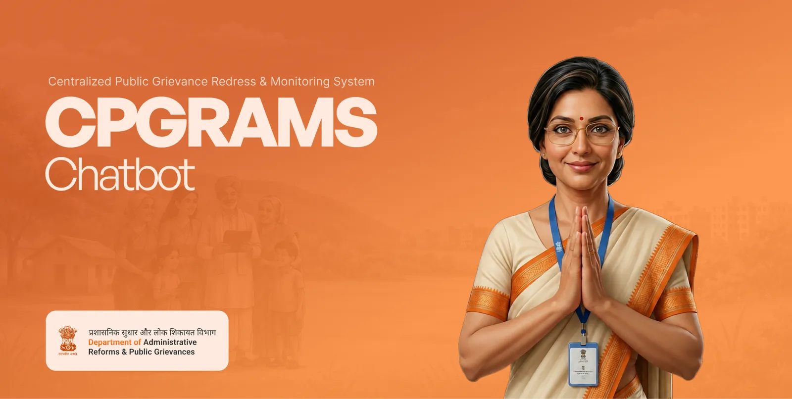
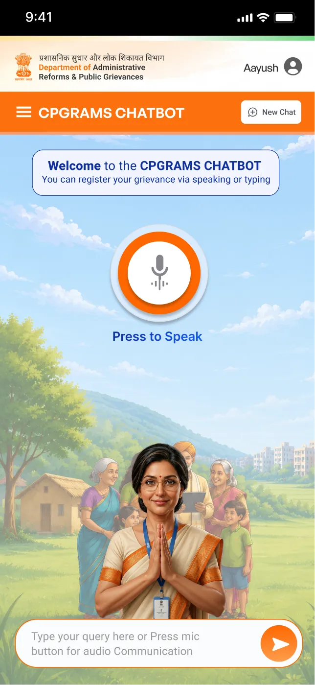
It opens with a person, not a form
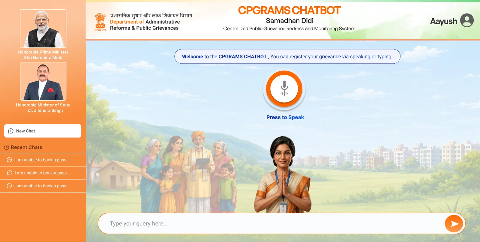
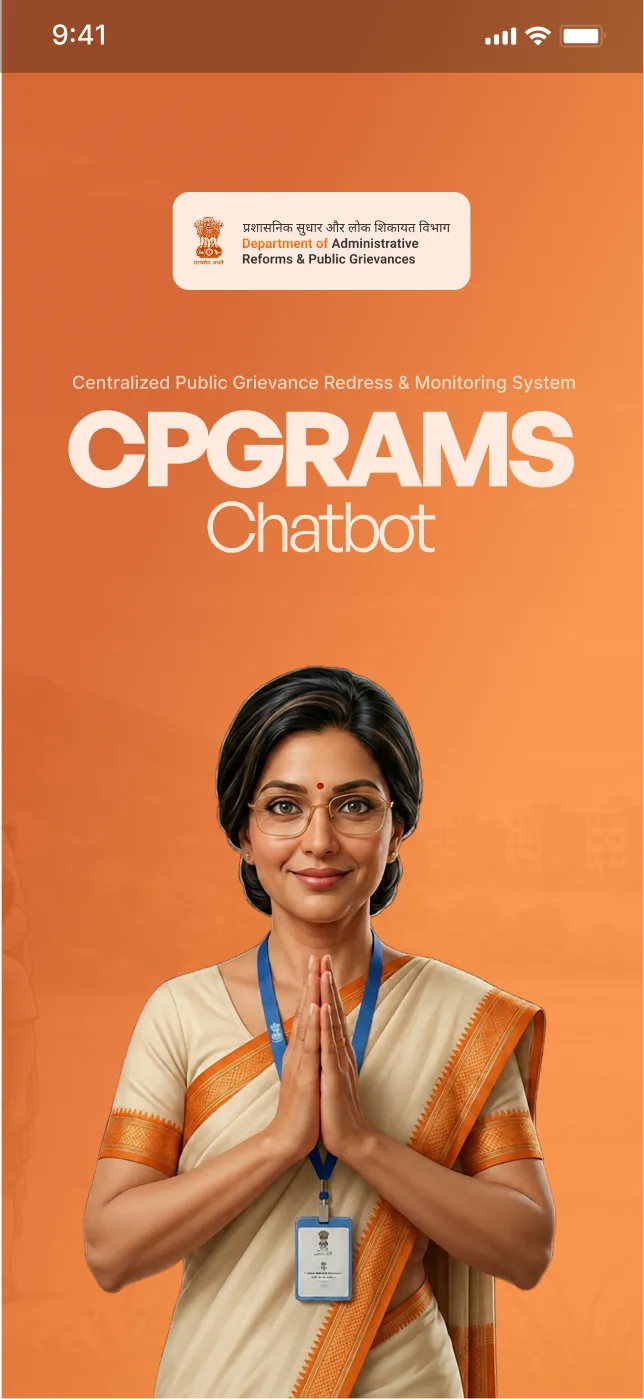
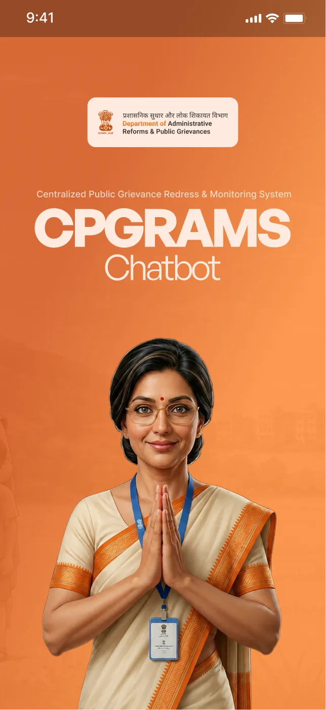
The first thing on screen is Samadhan Didi and the name of the department, on the state's own saffron. That is deliberate. What this product has to overwrite is whatever happened the last time this person opened a government website, and being greeted by someone who looks like staff does more for that than any amount of layout.
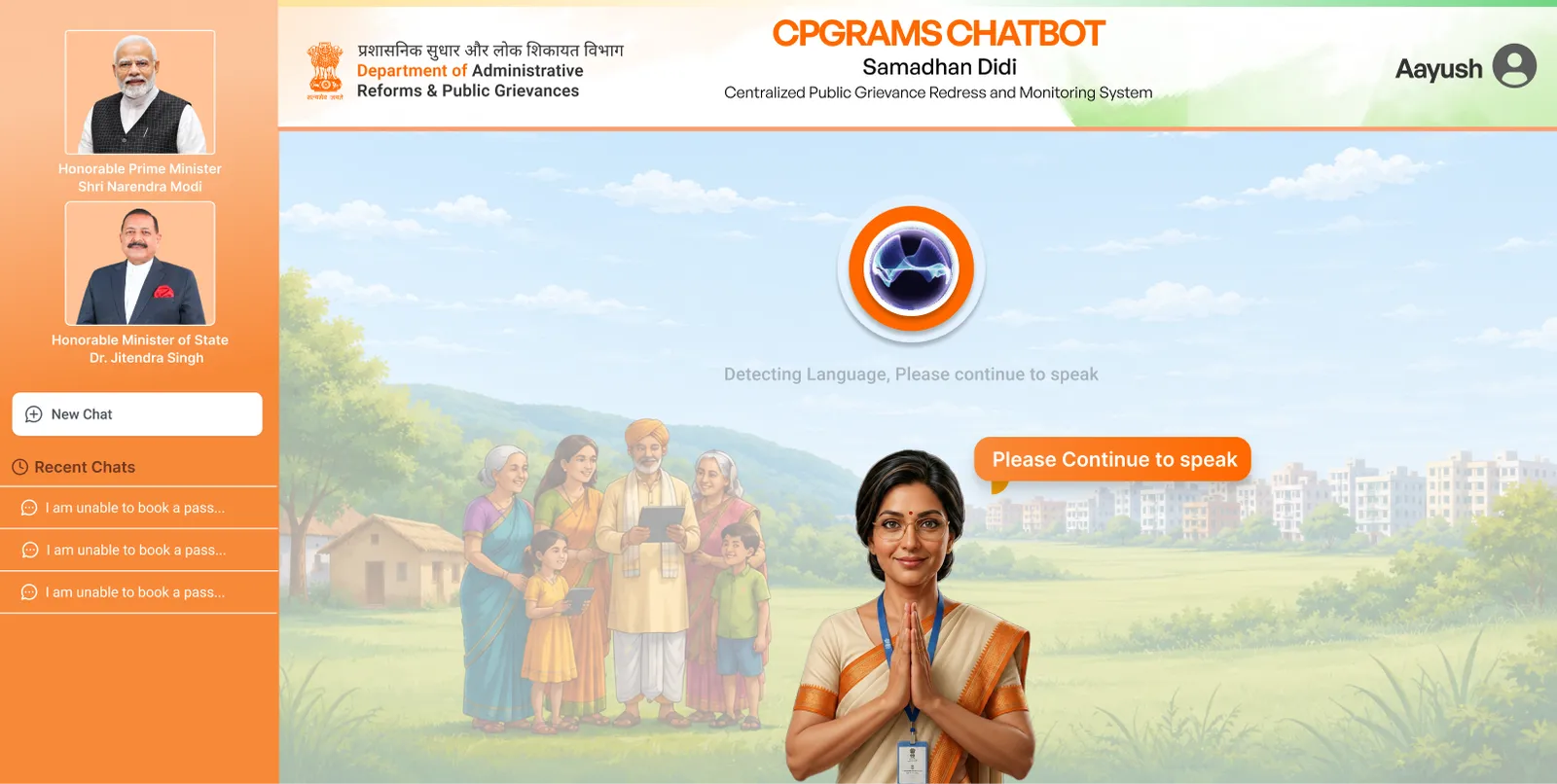
It listens before it asks you anything
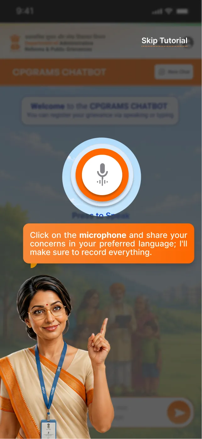
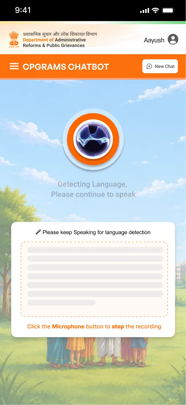
No language picker and no category dropdown, because both ask you to decide something before you have said a word. The orb reacts while you talk, on the exact control you just pressed, so there is never a doubt that it is on. One press starts and stops it: press-and-hold fails for tremor and arthritis, and the over-60s file more grievances here than anybody else.
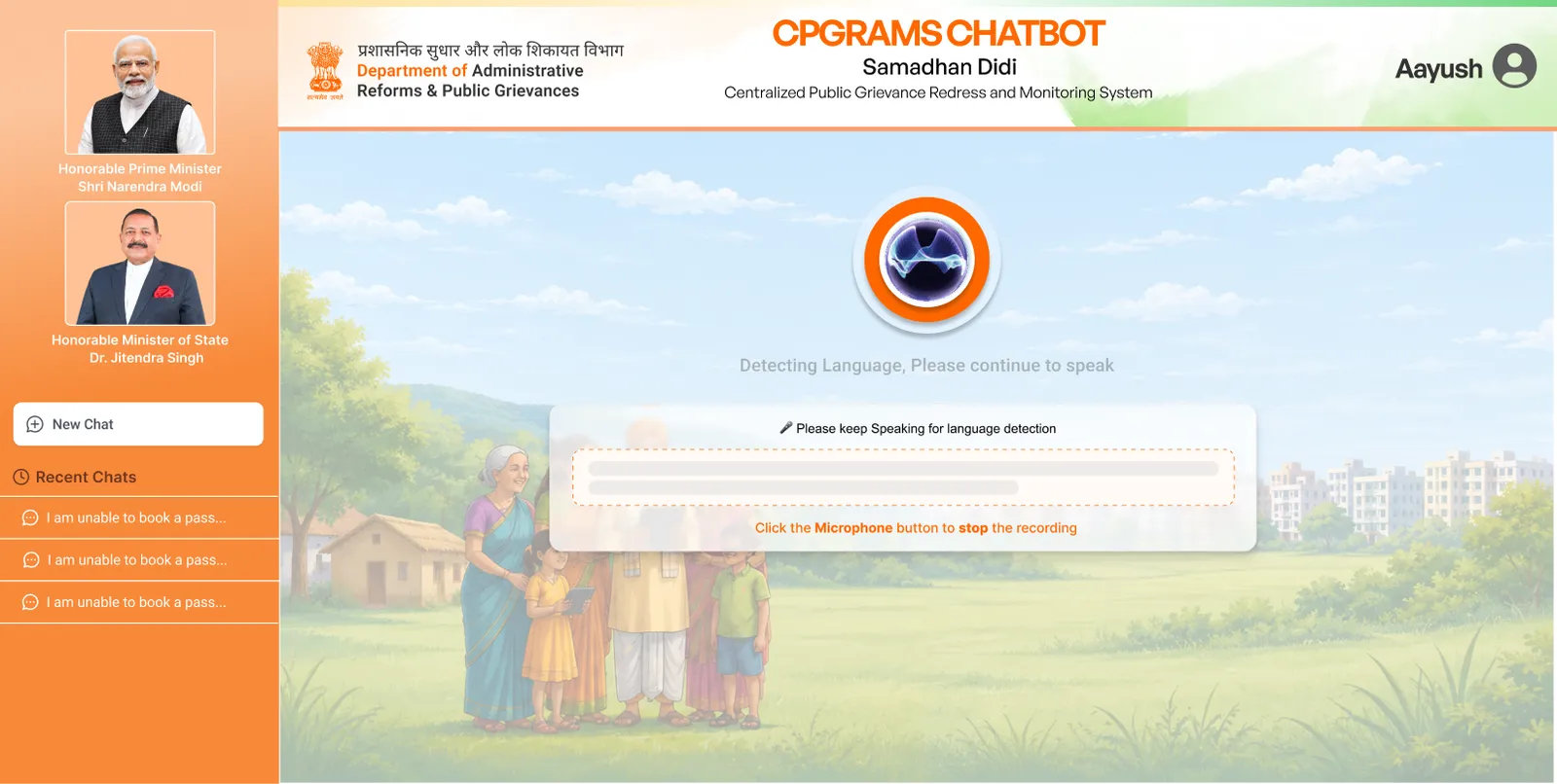
It says what it is waiting for
A silent pause during a wait reads as failure, especially on a connection where failure is normal. So the panel opens the moment recording starts, asks you to keep speaking while it works the language out, and says in plain words how to stop. Nothing hides behind a spinner.
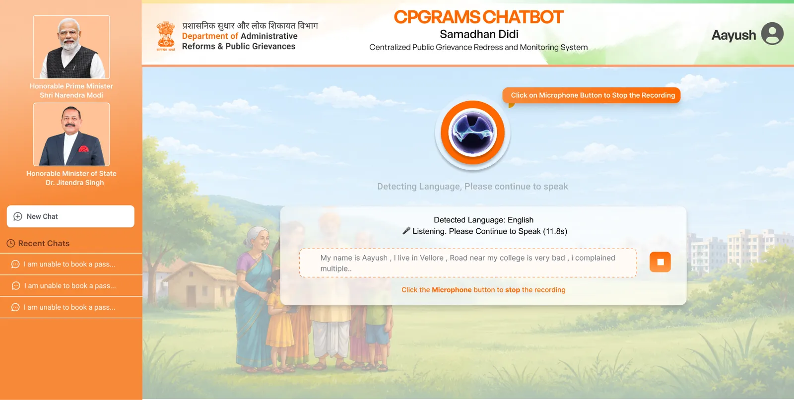
Your words come back while you are still talking
The transcript builds live, with the detected language above it and the elapsed time beside it. This is the cheapest place in the whole product to catch a mistake. A misheard road name costs nothing here, and costs a wrongly routed grievance if it gets through.
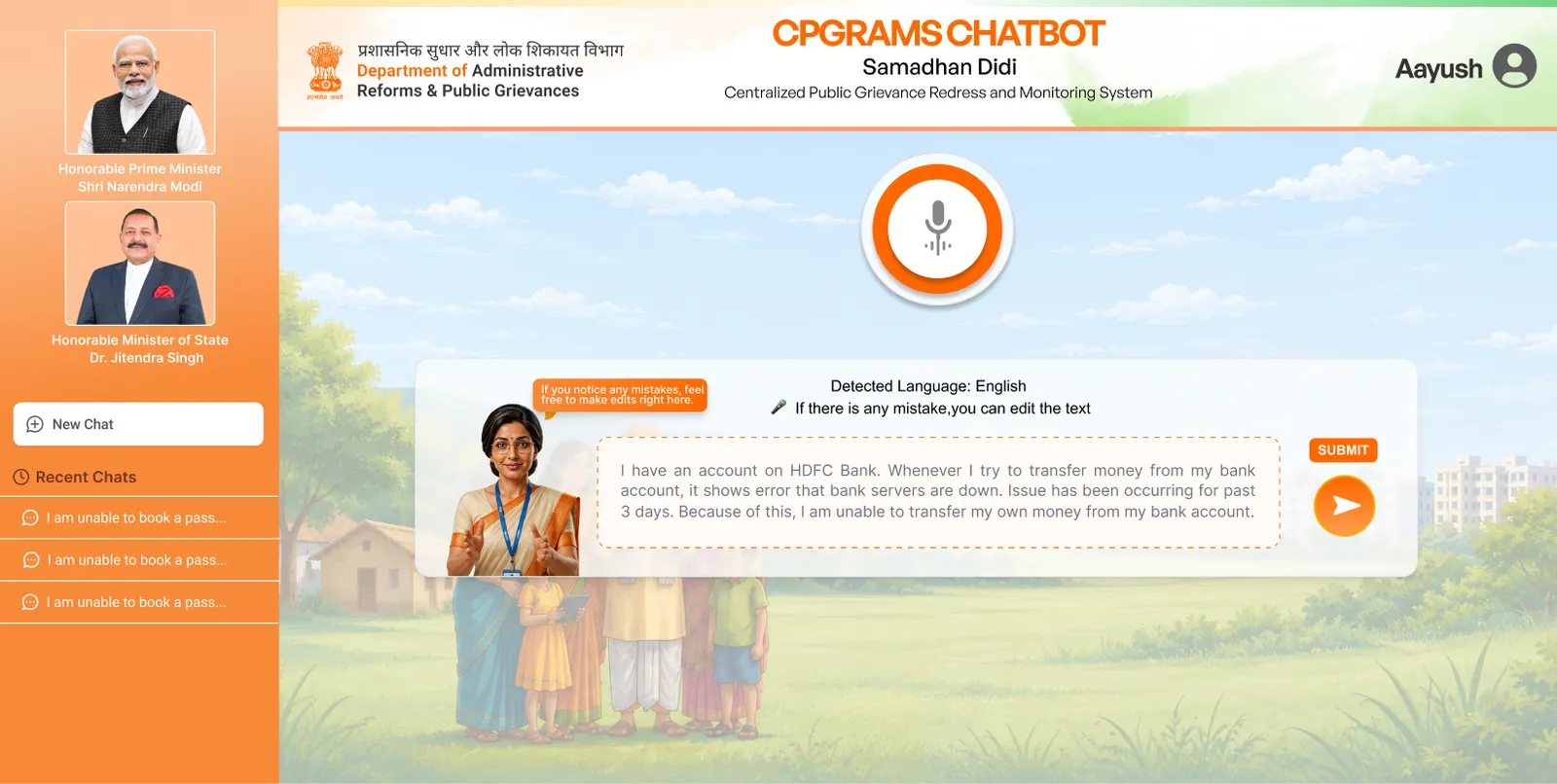
You get to fix it before it goes anywhere
Didi points at the text and says, in as few words as possible, that you can edit it. Corrections go back in by voice or by keyboard, so fixing an error never demands the skill the person arrived without. Nothing moves until Submit.
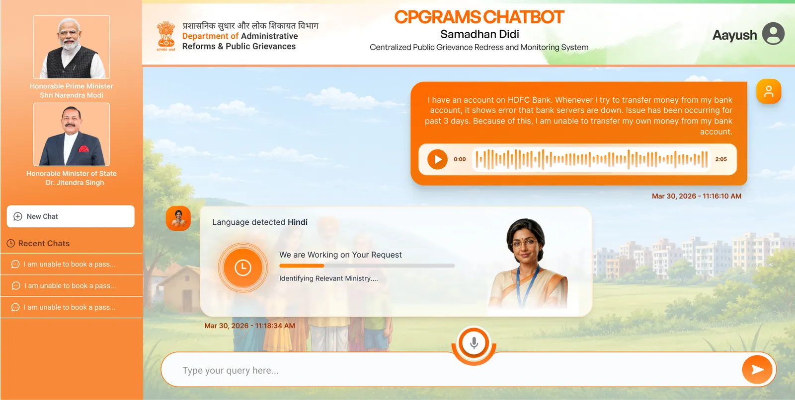
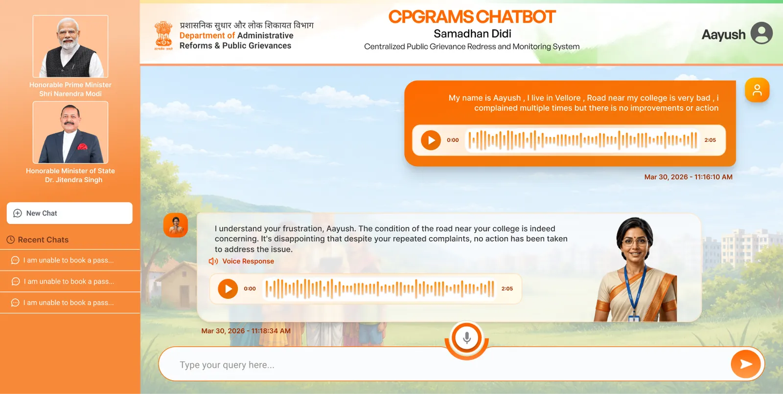
The recording stays in the conversation
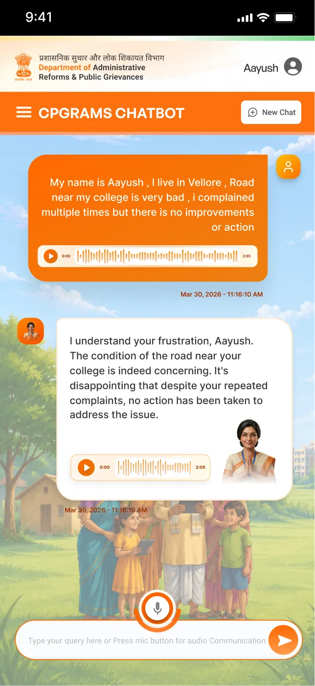
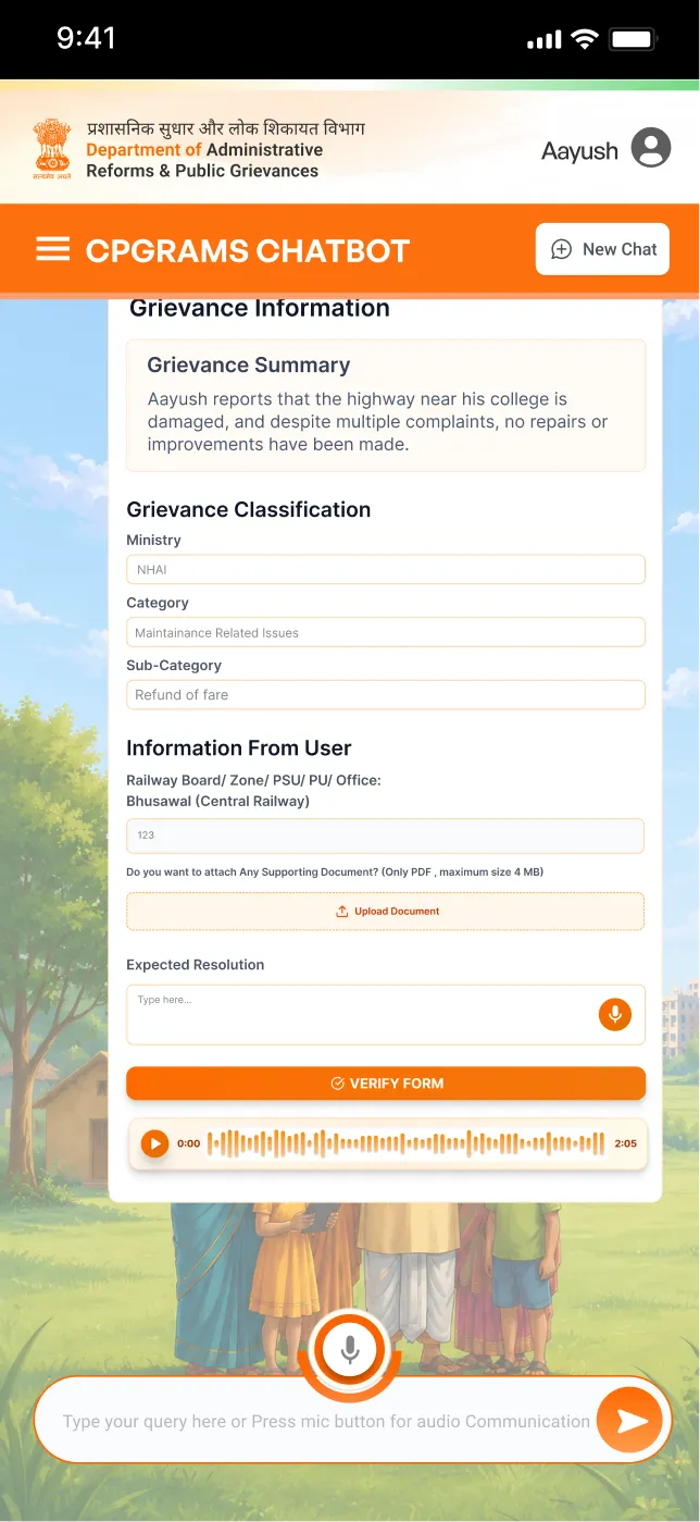
The audio is not thrown away once it has been transcribed. It is the one thing on this page the software cannot have got wrong, so it stays in the thread as a playable message. Underneath, the system names the step it is on rather than showing a bar: identifying the relevant ministry.
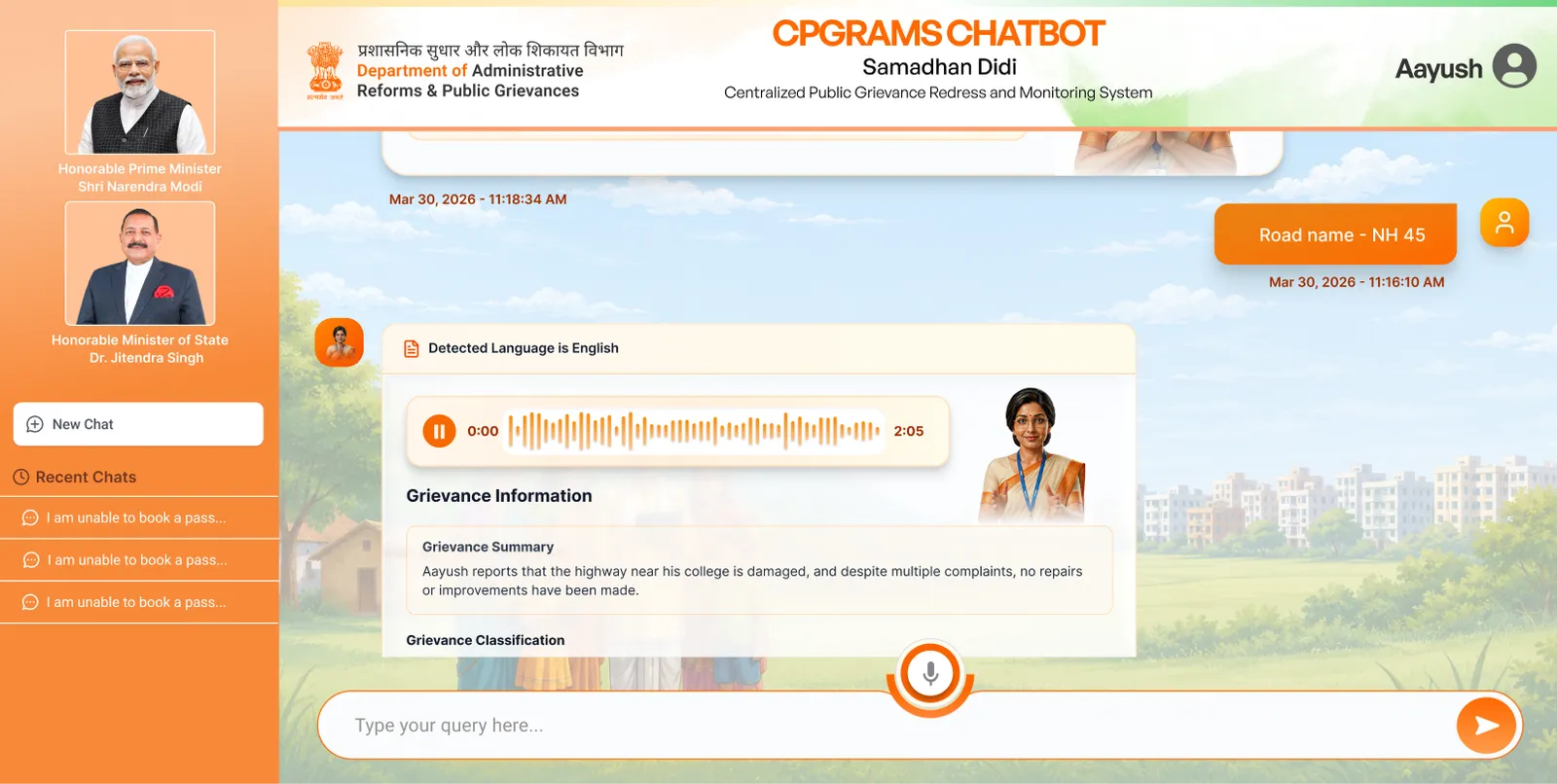
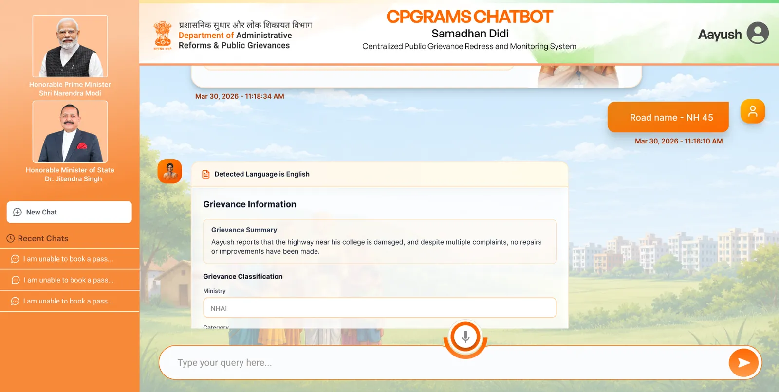
It asks for what is missing, one thing at a time
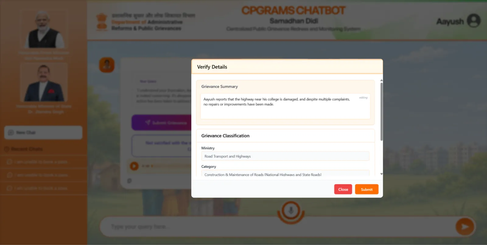
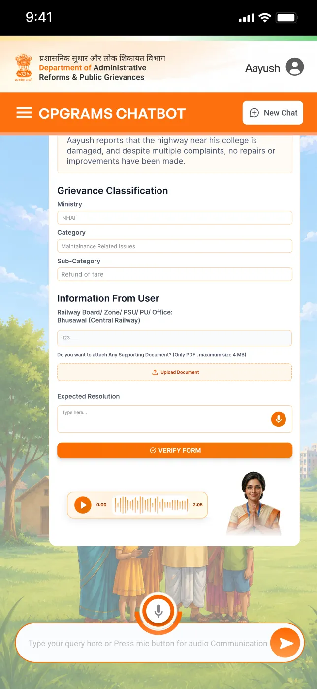
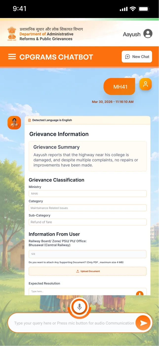
The road name is the sort of detail the portal buried in a field called Location. Here it is one question with one answer under it. Everything gathered so far then folds into a Grievance Information card: a plain-language summary, the ministry, the category, all of it worked out from what was said instead of chosen from a dropdown.
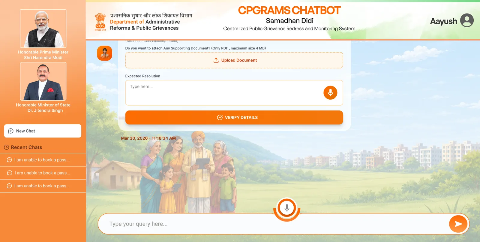
Documents are asked for at the moment they matter
Not as a checklist on screen one, which is a reason to close the tab. The upload appears only when the grievance actually needs paperwork, and the field beside it asks what you want to happen, which the original form never bothered to ask at all. Verify Details is the only way forward from here.
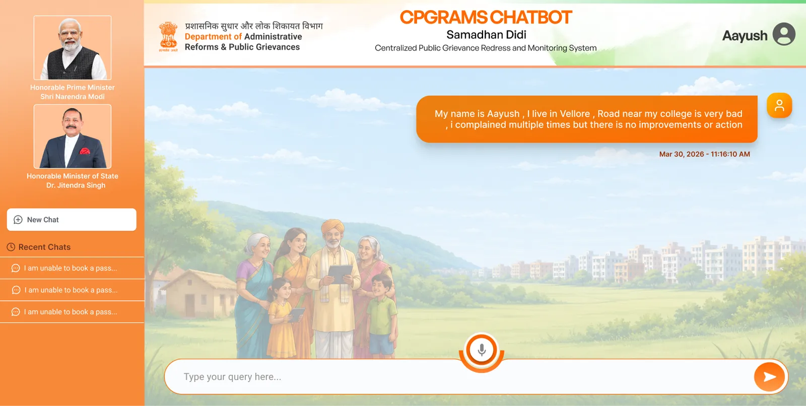
Typing gets the same first question
The input is focused and nothing else is required. The portal's first question was which of ninety ministries owns your problem. This one's is what happened, and all fifteen fields get filled out of that single paragraph.
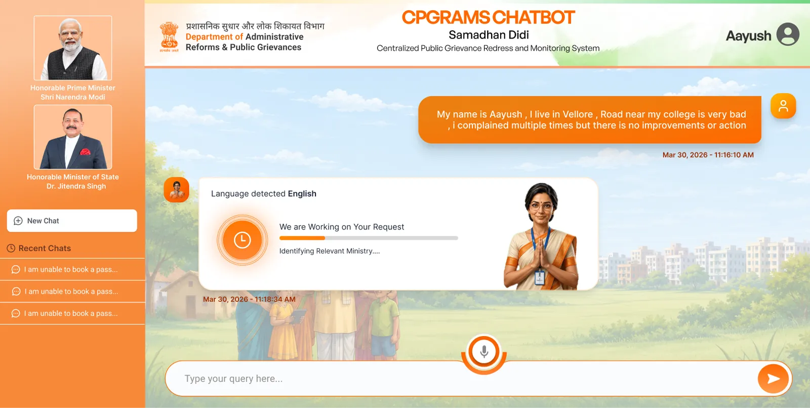
It tells you what it is doing while it does it
Language detected, then a progress line naming the actual step. This is the field that stopped six in ten people on the old form, and here it resolves in the background with the citizen watching rather than deciding.
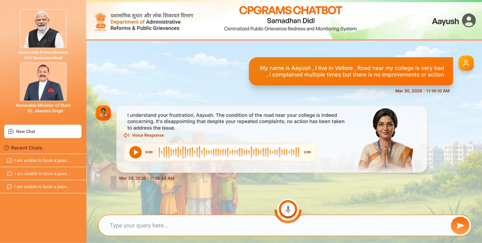
Every reply is spoken as well as written
Output parity is not a voice-flow feature. Someone who can type may still find a paragraph of official language easier to hear than to read, so the audio is always there. The reply also restates the problem before acting on it, which is comprehension you can check rather than a keyword match you have to trust.
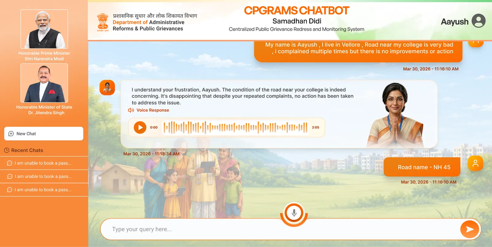
Follow-ups happen in the thread, not in a second form
One question, one answer, then on. Working memory stays free for the answer instead of the interface, which is the whole reason a conversation beats a page of fields for somebody doing this once, under stress, on a phone.
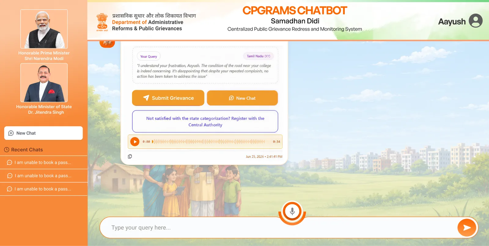
Three ways out, and none of them is the form again
Submit the grievance, start again, or escalate to the Central Authority when the state-level routing looks wrong. The system is allowed to be wrong. It is not allowed to be wrong with nowhere to go, which is exactly what the old portal did every time it dropped a session.
(04)
(What I tried)
The reframe
Once I wrote that down the brief changed. I was not designing a better portal, I was designing a translation layer over the one that already works. Same ministries, same categories, same statutory clock. The hard part does not vanish, it moves from the person complaining to the system that already understands how it is filed.
Every step is a chance to give up, and six in ten people take it.
- Register an account
- Read the interface in English or Hindi
- Work out the right ministry
- Work out the right category inside it
- Write the grievance in formal language
- Attach the right documents
- Clear a CAPTCHA
- Finish before the session expires
Everything else is inferred, filled and routed by the system that already knew it.
- Say what happened
- Check that it got it right
Constraints, and what they ruled out
Two things were fixed before I started. The government's taxonomy could not change, and I could not assume the person filing could read. Between them they kill the obvious answer, because a tidier form is still a reading test with a filing test stapled to it.
Each one fixes the surface and leaves the barrier standing.
- Redesign the form: cleaner, still a reading and filing test
- Add a language toggle: a picker is itself a reading test
- Build a native app: an install barrier for 2G users
Removes the two things that actually stop people.
- A conversation over the system that already exists
- Voice as the primary input, not a feature
Structure before surface
You cannot wireframe a chatbot the way you wireframe a page. There is no fixed layout, only a sequence of states and what each one is allowed to ask for. Four greyboxes settled it.
What changed
It is live at cpgramsaichatbot.com, running against the real grievance system rather than sitting in a deck as a concept.
A qualification test, sat before you were allowed to complain.
- Reading English or Hindi
- Knowing which of 90+ ministries owns your problem
- Knowing the right category inside it
- A desktop, or a phone used like one
- Finishing before the session expired
Everything else moved into the software that already knew it.
- Being able to speak
- Checking the system got it right
(05)
(The system)
The system underneath
Built for a conversation rather than a page: bubbles by speaker, audio players, state and language tags, the review card, spotlights, mascot states. Saffron is the state's own colour, and a grievance tool that invented its own would look like it belonged to nobody.
(06)
(Results)
These are the targets the work was scoped against, not results it achieved. Post-launch numbers sit with the department.
(07)
(What it taught me)
What I learned
I started out treating voice as a feature. It was the whole product.
For a while I designed it as one of two input options. Then I tried removing it on paper, and what was left was the form again, just friendlier. If a quarter of your users cannot read or write, everything else you do is decoration. Once I accepted that, the rest of the decisions got easier: detect the language instead of asking for it, speak every reply, never put a dropdown in the way.
Letting the AI do everything quietly would have been the wrong kind of easy.
My first instinct was to hide the whole process, since the form was the problem. But this is a legal complaint with somebody's name on it. If the system picked the wrong department and nobody saw it, that is worse than the form ever was. So the summary screen exists, and it is the plainest thing in the design. It is also the part I would defend first.
Small design mistakes stop being small at this scale.
A confusing dropdown is a minor usability issue in most products. Here it is millions of people who never get heard by their own government. It made me slower and more careful about the kind of detail I would normally ship and fix later.
Familiar worked better than clever.
I wanted to design something cleaner than a government portal. What actually worked was keeping the shape people already recognised, the left rail, the account corner, the input at the bottom, and spending the effort on the one thing that had to change. Novelty here would have cost trust I had no way to earn back.
(08)
(Gallery)




(09)
(More Work)

Got something in mind?
A job, a project, a wild idea. Whatever it is, drop me a message. Let’s see what we can make out of it.
- Looking for my next opportunity
- Open to freelance work
- Always happy to talk design