Projects

Brand Identity

DropBy

DropBy is for people who want to see other people without performing it: the app rewards you for showing up, not for posting. The old brand said none of that, so this rebuild takes the app's own radar ping and makes it the thing the whole identity is built out of.

  • RoleBrand Identity
  • Year2024
  • ToolsFigma, Illustrator, Photoshop
DropBy, cover

(01)

(About)

An app about turning up was being advertised by a brand that looked like it would rather stay in.

DropBy exists for the person who wants to see people and does not want to perform doing it. The product already understood that. It counts the turning up, not the posting about it.

The identity was arguing the other way. Quiet, unsure, easy to scroll past, which is a strange thing to be when your entire pitch is that somebody should get off the sofa tonight.

(02)

(Details)

(Challenge)

DropBy rewards you for showing up, not for posting. That is the entire product, and the old identity said none of it.

There was no cohesion, no typographic clarity and no colour strategy, so every touchpoint looked like it had come from a different app. Nothing in the writing sounded like a person either.

A brand whose one job is to get somebody off the sofa cannot be the quietest thing on the screen.

(Solution)

Build the brand out of the product. The radar ping, the app's own drop mechanic, becomes the repeating element: the mark, the layouts and the campaign are all the same gesture at different sizes.

One loud blue carries the system, with warm accents to break it before it goes cold, and a bolder sans so a headline can hold a wall on its own.

Then a voice written the way somebody would actually say it, out loud, to a friend who is already comfortable at home. Just Drop By.

An opening slide on DropBy blue reading: we reimagined DropBy into a brand that gets people to show up.A tiled pattern of overlapping gradient rings in blue, red and orange, labelled brand element in action.A wide billboard reading Just Drop By over a photograph of three people laughing, with body copy about valuing depth over display.Vertical banners hung between the columns of a stone building, alternating black Are You Alone panels with blue DropBy panels.

(03)

(Highlights)

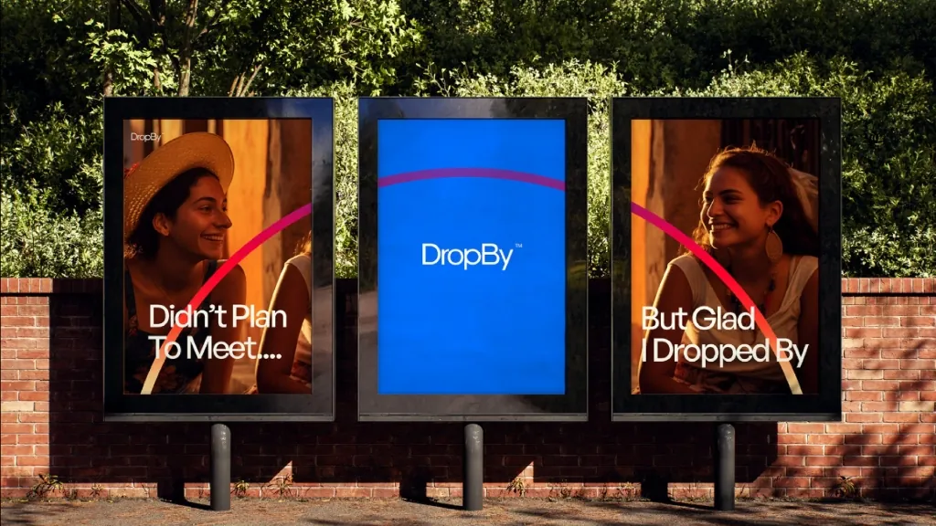
01 Didn't plan to meet

The lines are written as half-sentences that finish across panels, so the arc carries your eye from one to the next and the campaign only completes if you read the set. It is the radar doing the work again, this time as a connector between two strangers on two different posters.

The copy stays in spoken register: didn't plan to meet, but glad I dropped by. Nothing there sounds like a platform describing its features.

Three street posters: two photographic panels reading didn't plan to meet and but glad I dropped by, with a blue DropBy panel between them, connected by a gradient arc.Three posters on a concrete wall reading real vibes, random meets and stories don't start by chance, beside a photographic DropBy panel.

(04)

(Gallery)

A dark frame with a wide gradient arc sweeping from red through blue, and the word Encourage in a pill at its centre.The DropBy wordmark in white on the brand blue, set in a geometric sans with a small trademark symbol.
The DropBy palette board showing Alice Blue, Rich Black, Bandis Blue, Munsell, Tomato, Cleste and Vanilla, with a full spectrum gradient strip underneath.

(05)

(More Work)

Got something in mind?

A job, a project, a wild idea. Whatever it is, drop me a message. Let’s see what we can make out of it.

  • Looking for my next opportunity
  • Open to freelance work
  • Always happy to talk design

aayushvisuals