Gravitas
Gravitas is VIT Vellore's flagship techno-management fest, and its website is where thousands of students find and register for a catalogue of more than 200 events. The old one had grown into a wall of text that everybody saw the same way, so this is a rebuild around a retro-tech system that turns browsing into booking.
- RoleWebsite Design
- Year2025
- ToolsFigma, Illustrator

(01)
(About)
Nobody was failing to find events, they were failing to get from two hundred of them down to one.
A fest site gets about ten seconds from a student who already half knows what they want. Gravitas had the opposite problem to most sites: nothing was missing, everything was there at once.
Two hundred events is a good problem to have and a terrible page to read. Most of the rebuild is about giving a student permission to ignore nearly all of it.
(02)
(Details)
(Challenge)
Gravitas runs 200+ events over three days, and the site is how almost everybody finds out any of them exist. It had scaled into content saturation: the same wall of text, in the same order, for everyone, with no way to narrow it.
A first-year looking for a beginner workshop and a final-year hunting a hackathon were handed identical pages. Neither of them was the audience for it.
And there was nowhere to put a maybe. An event you liked but were not ready to pay for had no place to go, so coming back meant starting the search over.
(Solution)
Ask who you are before asking what you want. Role-based entry filters the catalogue the moment somebody signs in, so the page starts narrow instead of starting with everything.
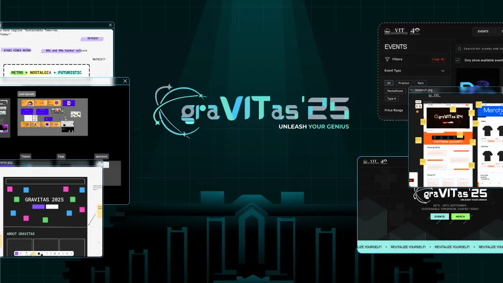
A retro-tech system gives the density somewhere to live. A hard grid, pixel display type and high-contrast panels make scale read as organisation rather than as noise.
Then filters by category, price and team size, and a wishlist that sits ahead of the receipt, so a maybe finally has somewhere to go and coming back is not a fresh start.


(03)
(Highlights)
01 Affiliation
Picking VIT student or external participant first means the form that follows only asks what that person can answer. A student never sees organisation and designation fields, and an external participant is never asked for a registration number they do not have. The branch costs one tap and removes every irrelevant field after it, which is cheaper than one long form that makes everybody skip past half of it.
It also sets up everything downstream. Once the system knows the affiliation, the catalogue, the pricing and the eligible events can differ without the user filtering for any of it.


01 The filter rail
Filters sit in a persistent left rail rather than behind a button, because a catalogue this size is used by narrowing repeatedly, and a filter you have to reopen each time gets used once. Category, price and team size are the three questions a student actually arrives with, so they are the three that get controls.
Every card carries time, date, team size and price on its face. Those are the details that decide whether an event is even possible for you, and putting them behind a click turns a shortlist into a tab-opening exercise. Only show available events is on by default, since a full event you cannot join is just another row to read past.


01 Wishlist first
The profile used to be a receipt list. Here the wishlist is the first tab, ahead of purchased merch and purchased events, because a profile organised around what you already bought is a record, and one organised around what you meant to do next is a way back in.
It also matches how these decisions actually get made. Students shortlist events, check them against friends and a timetable, then book. Without somewhere to hold a maybe, that gap between interest and registration is where the visit ended.


(04)
(Results)
(05)
(More Work)
Got something in mind?
A job, a project, a wild idea. Whatever it is, drop me a message. Let’s see what we can make out of it.
- Looking for my next opportunity
- Open to freelance work
- Always happy to talk design