Riviera
Riviera is one of the largest student fests in the country, and its website has to do two things that pull against each other. It has to make the scale of a whole week land, and still let one student find the one event they actually came for.
- RoleWeb Design
- Year2026
- ToolsFramer, Figma, Motion

(01)
(About)
Show everything and it becomes a directory, hide it and the fest looks smaller than it is.
Most students opening the Riviera site are not browsing. They heard one event named once, and they want to know when it is, what it costs and where to sign up.
Everybody else is doing the exact opposite. They know the name, they have no idea what is inside it, and the first screen is the only chance to make a week look worth clearing a calendar for.
(02)
(Details)
(Challenge)
Riviera is one of the country's largest student fests, with dozens of events and sub-brands sitting underneath the one name.
Put them all on the homepage and it becomes a directory. Hide them and the fest looks smaller than it is.
The two people arriving want opposite things. One heard a single event named once and wants the date, the price and the sign-up link. The other has never heard of any of it and needs a reason to care about a whole week.
(Solution)
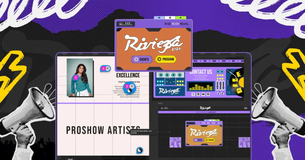
A motion-forward homepage carries the energy and signals the scale, so the first impression is the event itself rather than a list of its parts. That answers the second reader before they have scrolled.
Underneath it, a content architecture built to hold dozens of events and sub-brands. The depth is there the moment somebody goes looking for it, and the front page never has to carry all of it at once.
(03)
(More Work)
Got something in mind?
A job, a project, a wild idea. Whatever it is, drop me a message. Let’s see what we can make out of it.
- Looking for my next opportunity
- Open to freelance work
- Always happy to talk design