
Gravitas Identity
Visual branding | Graphic design
2025
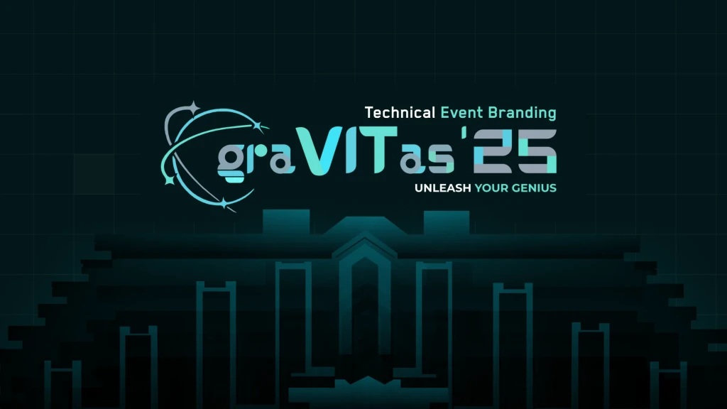
graVITas '25 is VIT's techno-management fest: 250+ events, 30,000+ attendees and participants from around the world. As design coordinator I held its identity together across the logo, website, merchandise, ID cards, print, hoardings and the entrance gate, with one dark ground and a single cyan.
Services:
Challenge:
One fest, hundreds of pieces, many hands.
Role:
Design coordinator for graVITas '25: identity, web and print across the fest.
01
About
Many people made the pieces at different times, so the system had to be recognisable before anything on it was read.
Every one of 250+ events needs something printed, worn, hung on a lanyard or walked through. Without one system, a fest's identity drifts between the poster and the pass.
And the physical and the digital pull opposite ways: a hoarding is read at fifty metres, an ID card at fifty centimetres, and a website in the three seconds it takes to decide whether to register.
02
Details
- Event
- graVITas '25, VIT Vellore
- Scale
- 250+ events, 30,000+ attendees
- Scope
- Identity, web and print
Challenge
The same system had to hold on hoardings, lanyards, certificates, merchandise, a gate and a registration page, each made to its own deadline.
Solution
The mark carries the name inside it. graVITas sets VIT in the middle of its own word with an orbital ring around it: a wordmark, a monogram and the fest's idea in one form.
One dark ground, one cyan. Every surface sits on near-black with a single electric cyan doing all the signalling, so a piece is recognisable before it is read.
Proved on the hardest surfaces. Six ID card variants from Chief Patron to Volunteer, a gate taken from sketch to a built structure, certificates, merchandise, hoardings and brochures.
03
The full case study


Keep exploring