Layover
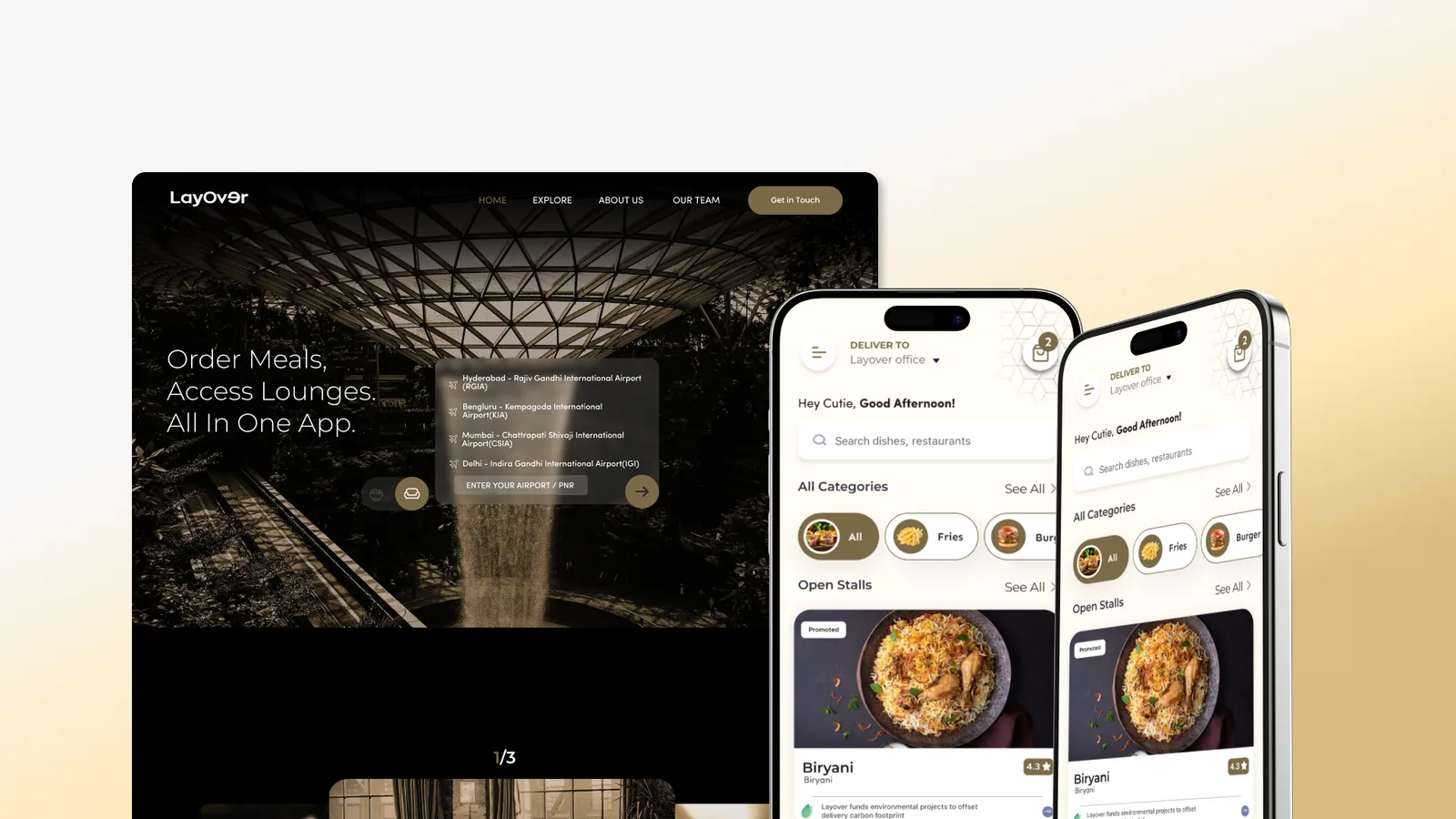
A layover is dead time you have already paid for, and Layover turns it into something usable: put in your airport or your PNR and it shows what is open in your terminal right now, so you can order a meal to your gate or book a lounge seat. I joined at zero and took it to four surfaces: the site people land on, the app they order from, the portal a restaurant runs its kitchen on, and the console the whole platform is operated from.
- RoleLead Product Designer
- Year2025
- ToolsFigma, Prototyping

(01)
(About)
Travellers were not struggling to order, they were struggling to predict time.
Every airport sells you the same thing twice: a ticket out, and the two hours you have to spend before you can use it. The second one is a service nobody had bothered to design.
So this was never really a food-ordering project. It was an attempt to make an airport legible for the ninety minutes you are stuck inside it, which turned out to need four products rather than one.
(02)
(Details)
(Challenge)
You are standing in a building full of food and lounges with no way to know what is open, how far away it is, or whether you have time to get there and back before boarding. That is the traveller's half of it.
The outlet's half is the mirror image: a counter, a paper queue, and no idea how many people are about to walk up. Terminal restaurants had no listing, no live menu and no way to take an order ahead. Lounge access was a guess you confirmed at the desk, in front of a line.
The category is not short on supply either. The dominant player already holds the bank, airline and lounge partnerships. What it does not have is a product anyone wants to open twice, and it sits at two stars. Nobody had built the layer between the two sides.
(Solution)
Treat it as a time problem, not a food problem. The moment that landed, every screen resolved: the prep-time badge stopped being a detail and became the loudest thing on a card, Get Directions earned equal weight with Order Now, and the QR code stopped being a payment feature and became a queue-removal feature.
Then build all four sides of it, because none of them works alone. A traveller who orders is only fed if the kitchen sees the ticket. The kitchen is only on the platform if somebody approved it. And none of that matters if the person googling from the departure gate cannot find the site.
Same system across all four, opposite temperature. Dark and warm for travellers, light and dense for operators, because one is read on a phone in a dim terminal and the other under a fluorescent tube at arm's length.


(03)
(The website)
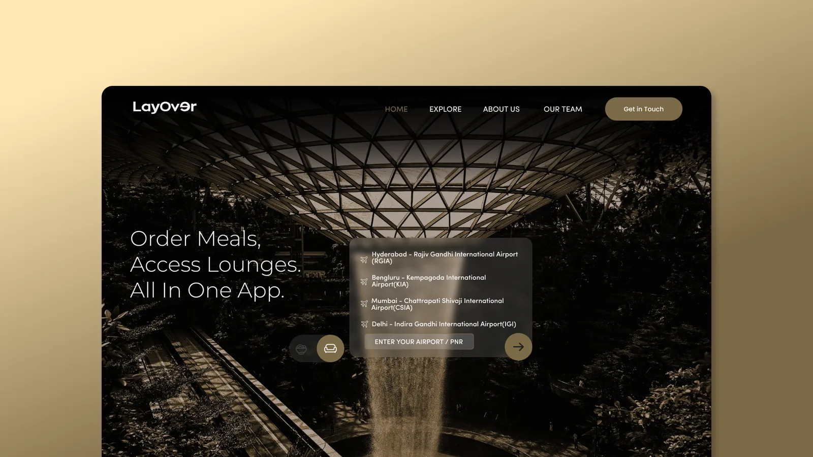
The front door, and for most people the whole product until they install anything. It took six labelled passes to get here. The version that shipped stops explaining Layover and starts being it: the airport picker lives inside the hero, so the first thing the site does is the first thing the product does.
The hero does the product's job, not the product's pitch
Three lines of copy, then a live airport picker. Earlier passes opened with a carousel and a paragraph explaining what a layover is, which every traveller already knows. Pick an airport and the next thing it asks is which terminal, in a dialog it will not let you skip: that looks like friction and is the opposite, because nothing on the page after it is true until it knows. Everything further down is ordered by distance from the payoff: the three-step explainer, the lounge tease, the app download, the footer.

Four questions on the card, then a countdown
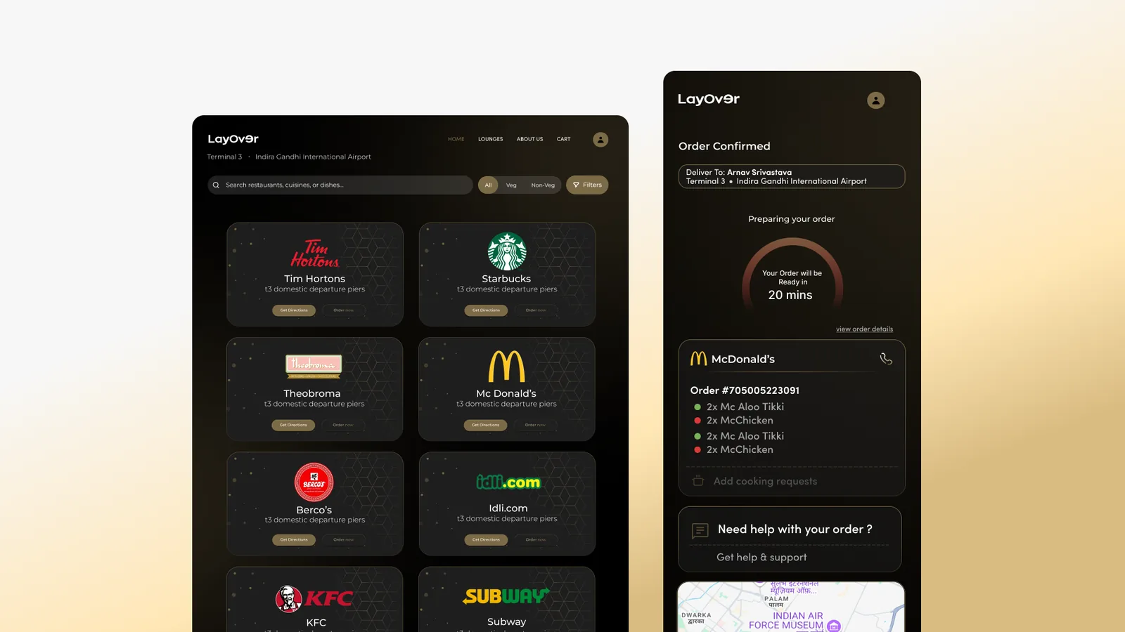
The directory on the left answers four questions before you click anything: who, how far, how good, how long. The pier replaces the street address, because in a terminal where is the only question that matters, and Veg and Non-Veg sit in the header beside All rather than behind a Filters drawer. Then, once the order is in, the only thing that matters is the number of minutes. The itemised order, the outlet's phone number and the map stay under it, so when something goes wrong you are ten metres from the person who can fix it.

(04)
(The traveller's app)
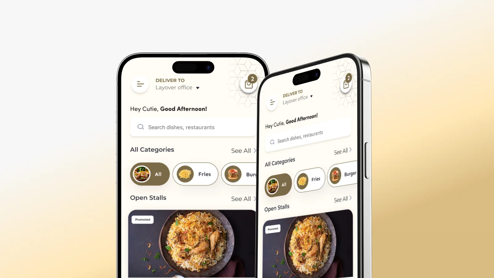
The app is for the people who fly often enough to install something. It opens on the only question that matters, which airport and which terminal, because until it knows that nothing it could show you is true.
Arriving, and getting located
The onboarding says what the app does and gets out of the way. Skip sits on the first frame, not the last, because making a confident user sit through three screens to reassure an uncertain one is a tax paid by the wrong person.
Then the only question that matters. Domestic or international decides which piers you can reach and the terminal decides the entire menu, so all of it is asked once, up front, as radio buttons rather than a search, and stays editable from the header on every screen after this. Sign-up took thirteen versions before it ended up behind the browsing instead of in front of it.


Choosing, and paying
Prep time is the loudest thing on every card, and it follows you down from the outlet into the menu header. On a restaurant app the price decides; in a terminal the clock does. The veg toggle sits top right where a thumb reaches it, the veg mark repeats on every item rather than living only in a filter, and the floating jump control exists because an airport menu is long and you are reading it standing up with a bag on your shoulder.
The bill is itemised before the button: item total, GST, platform fee, and the platform fee's own GST, all visible without expanding anything. Airport pricing is what travellers are most suspicious of, so hiding a line here would cost more trust than the line is worth. This is also where the account is finally asked for, and not one screen earlier.


(05)
(The restaurant portal)
Here the visual system flips. An order queue is read standing up, under fluorescent light, at arm's length, by somebody whose hands are full. So it goes light, flat and high contrast, with nothing decorative competing with a number.
Six steps, and a straight answer at the end of them
Registration, contact verification, documents, review. The last frame does the thing most onboarding flows skip: it says what happens next and how long it takes, 34 to 48 hours, with the checks listed. An airport outlet signing up to a platform they have never heard of needs that more than they need a prettier form.

One incoming order, and a wall of everything else
The new order takes the top of the screen on its own, with Accept and Reject as the two largest targets on the page. Everything already accepted drops into the grid below, colour-coded Ready or Delivered with a timer running on each. There is no navigation to learn, because the whole job lives on one surface.

Menus edited where they are read
Sections and items sit the way the traveller will see them, and each is edited in place rather than through a separate builder. Availability is a toggle on the card itself: a stale menu in an airport means a refunded order and a passenger who has already boarded, so turning one item off has to cost one tap.

The screen a new outlet actually sees first
A vendor's first login shows a menu with nothing in it. That is their first impression of the entire platform, so it got the same attention as the dashboard: one illustration, one sentence, one button, and the same Add Section control that lives in the header, so the thing you learn here still works tomorrow.

Build it on the left, watch it appear on the right
The form and the coupon it produces sit side by side, so the outlet sees what the traveller will see while they are still typing. Coupons ship with a QR code because half of airport promotion happens on a printed standee next to the till, not inside an app.

Revenue, and the shape of an airport day
Today against yesterday at the top, then the month, then Activity by time, which is the chart that actually earns its place here. An airport kitchen staffs against flight banks rather than against lunch and dinner, and this is the only screen in the product that shows them where those banks are.

(06)
(The admin console)
The layer nobody sees and everything depends on. Built for scanning rather than exploring: four navigation items, and every vendor row surfacing the same four metrics in the same four positions, so a hundred outlets read at the speed of one.
Approve or reject, with the whole case on one row
Contact, category, submitted date, the documents behind a View, then the two decisions. Everything needed to make the call sits on the card, so approving a vendor never turns into a tab-switching exercise. Add New Vendor is in the corner for the outlets that get onboarded in a meeting rather than through the form.

Orders, revenue, rating, prep time. Always in that order.
Four metrics, four fixed positions on every row, and one switch that takes an outlet offline. Prep time is on this list for the same reason it is on the traveller's card: it is the number that predicts a complaint. Manage opens that vendor's own portal, so support never has to describe a screen down a phone.

Admin can fix a menu without asking anyone
At launch an outlet's first menu upload is rarely right: wrong prices, missing veg marks, an item that does not exist any more. So admin can correct it directly, and the edit screens here are identical to the vendor's own, because two interfaces for the same job is how the two drift apart.

(07)
(Results)
These count what got designed, not how it performed. The product has not launched to the public yet, so there are no usage numbers to report and I am not going to invent any.
(08)
(Gallery)


(09)
(More Work)
Got something in mind?
A job, a project, a wild idea. Whatever it is, drop me a message. Let’s see what we can make out of it.
- Looking for my next opportunity
- Open to freelance work
- Always happy to talk design