

Meal Maestro: planning a week of food without making a single decision
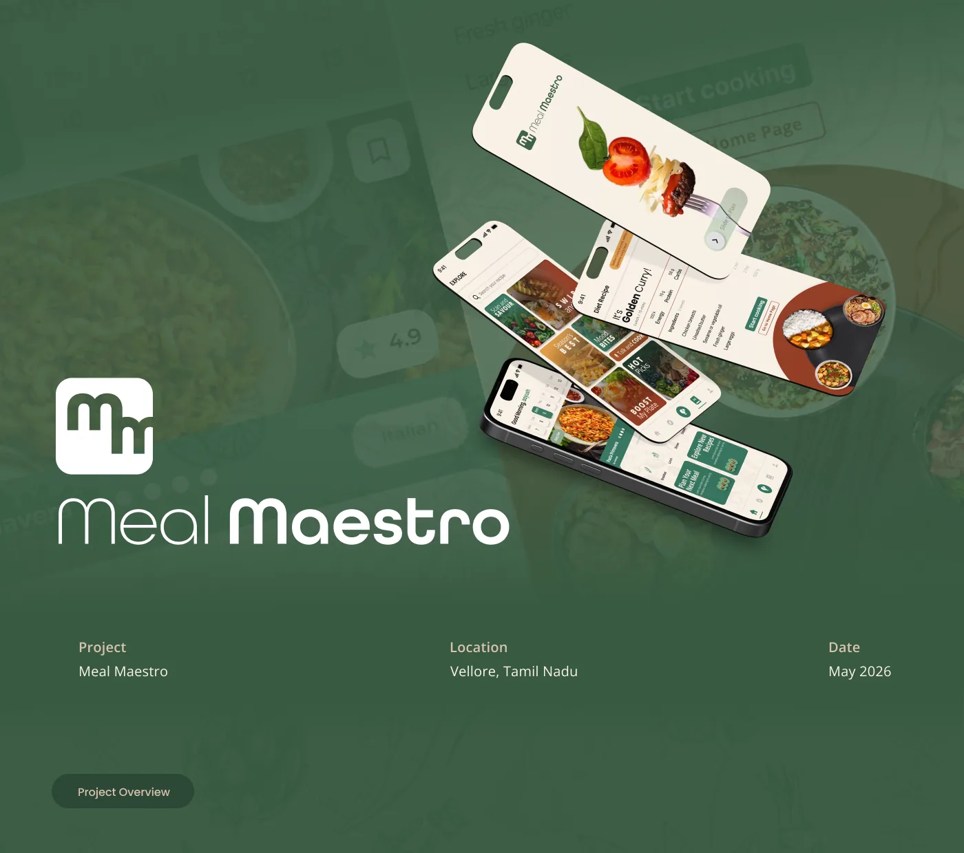
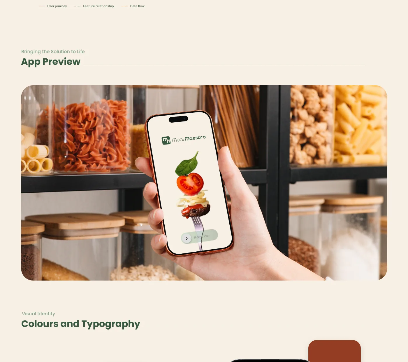
Meal Maestro is a meal-planning app built on the one thing twelve interviews kept saying: the hard part is not the cooking, it is the deciding. It takes what you like, what you avoid and what is already in your kitchen, and hands back a week of recipes with the single grocery list that covers all of them.
- RoleUI design
- Year2025
- ToolsFigma

(01)
(About)
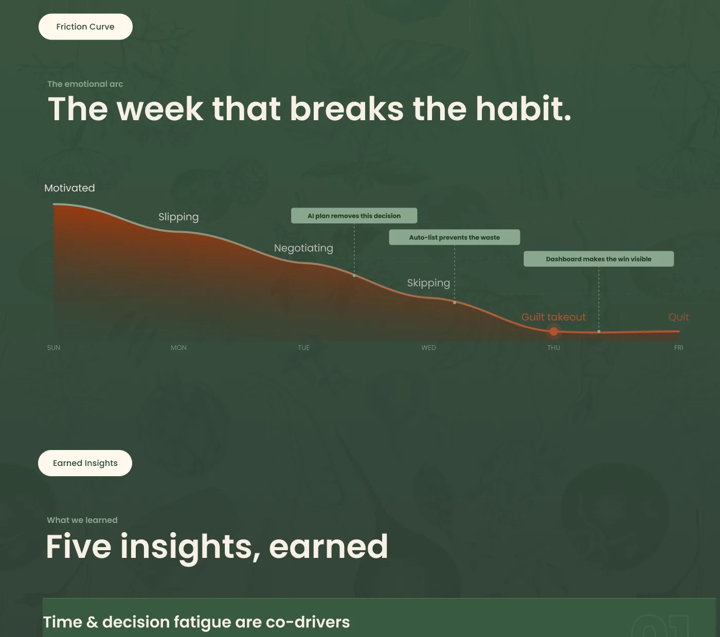
People do not give up on meal planning because they cannot cook, they give up because by Wednesday they have no decisions left.
Almost everybody who quits meal planning quits in the same place, and it is never the stove. It is a Wednesday evening, at the end of a working day, in front of a fridge.
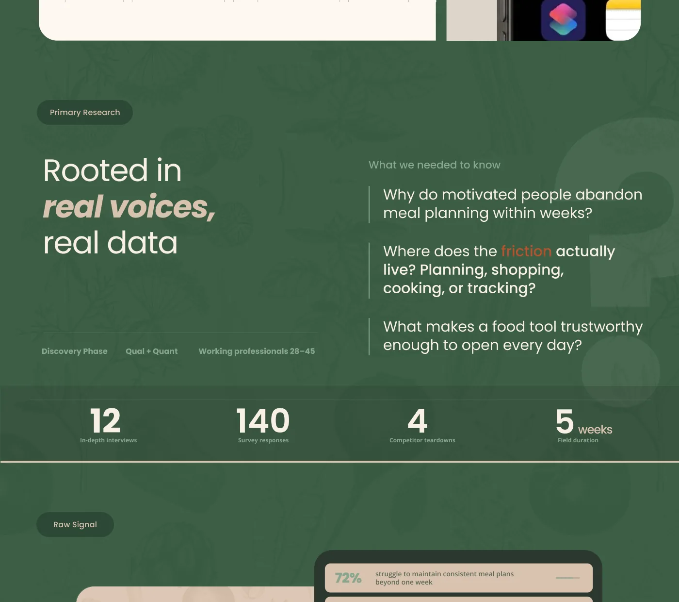
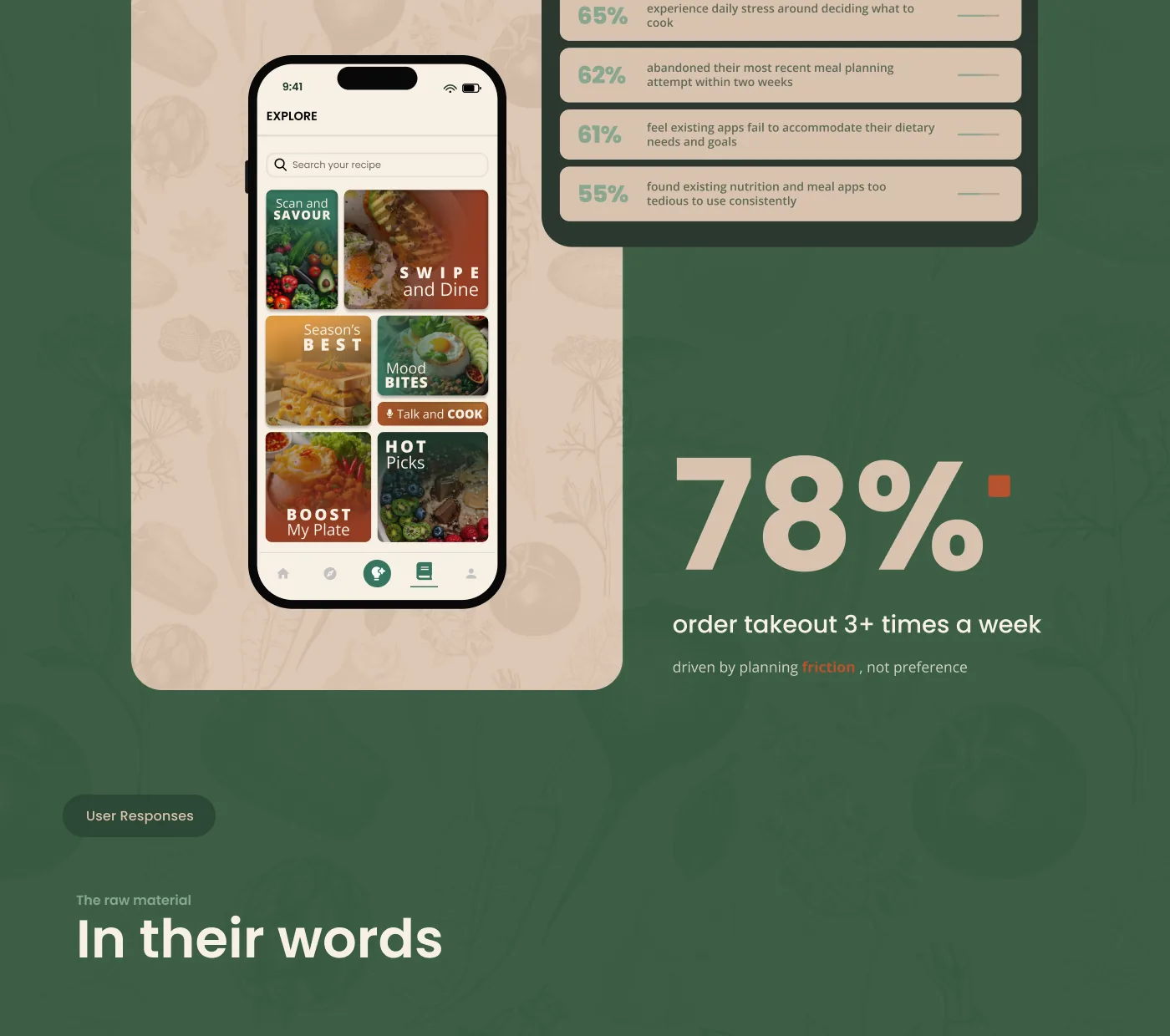
So the product had to remove decisions rather than add features, which is the opposite of what the category does. Twelve interviews, 140 survey responses and third place at the GDG Design-a-thon all came out of following that one line.
(02)
(Details)
- Recognition
- 3rd: GDG Design-a-thon
- Research
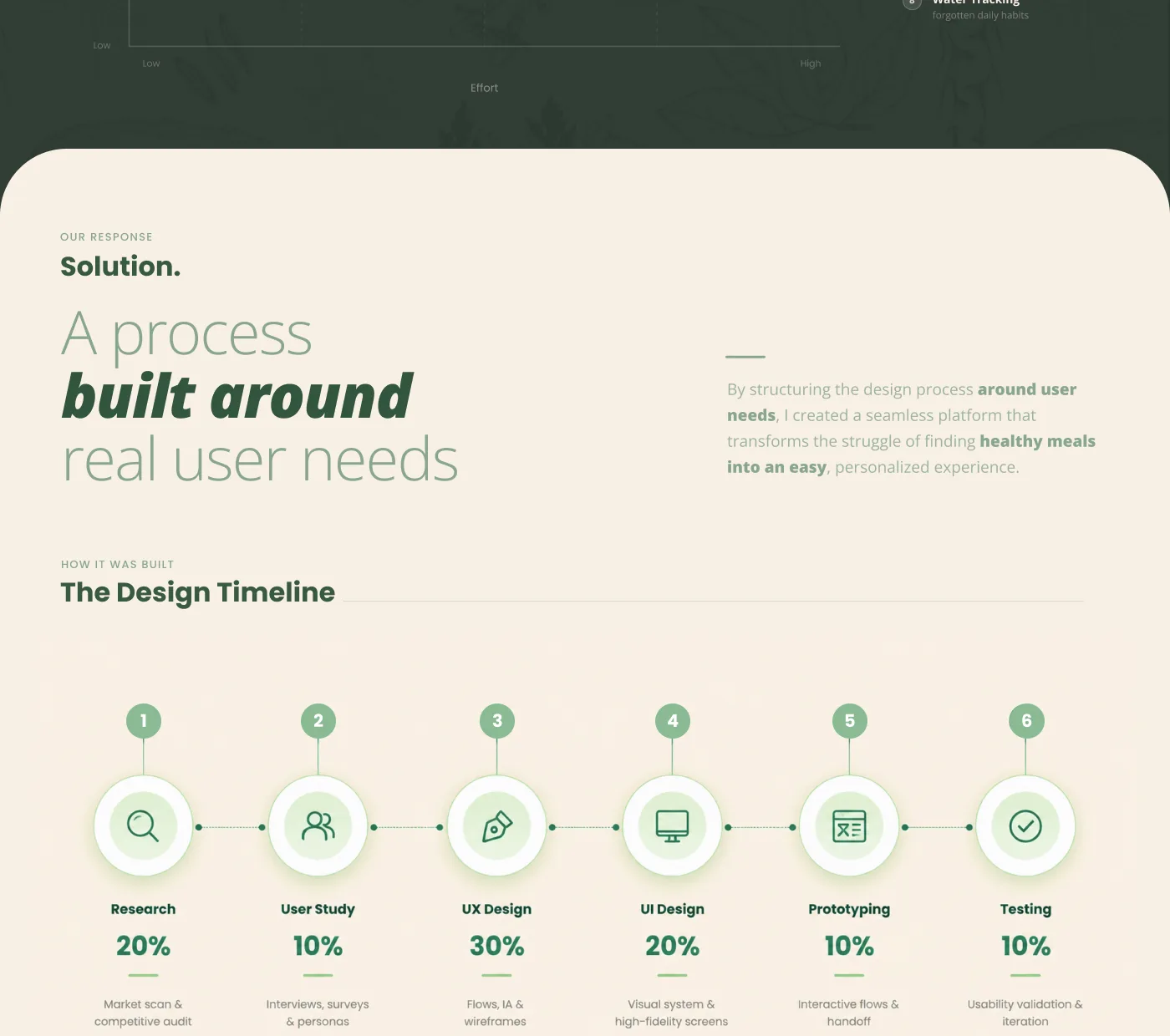
- 12 interviews · 140 survey responses · 5 weeks
(Challenge)
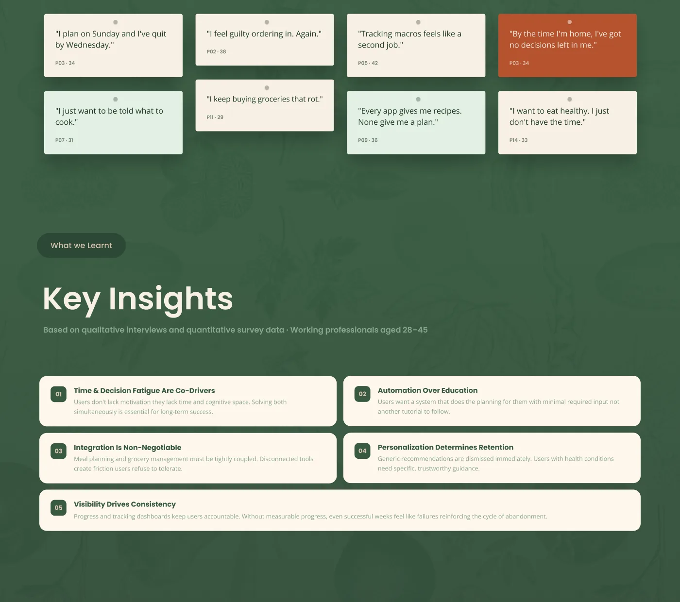
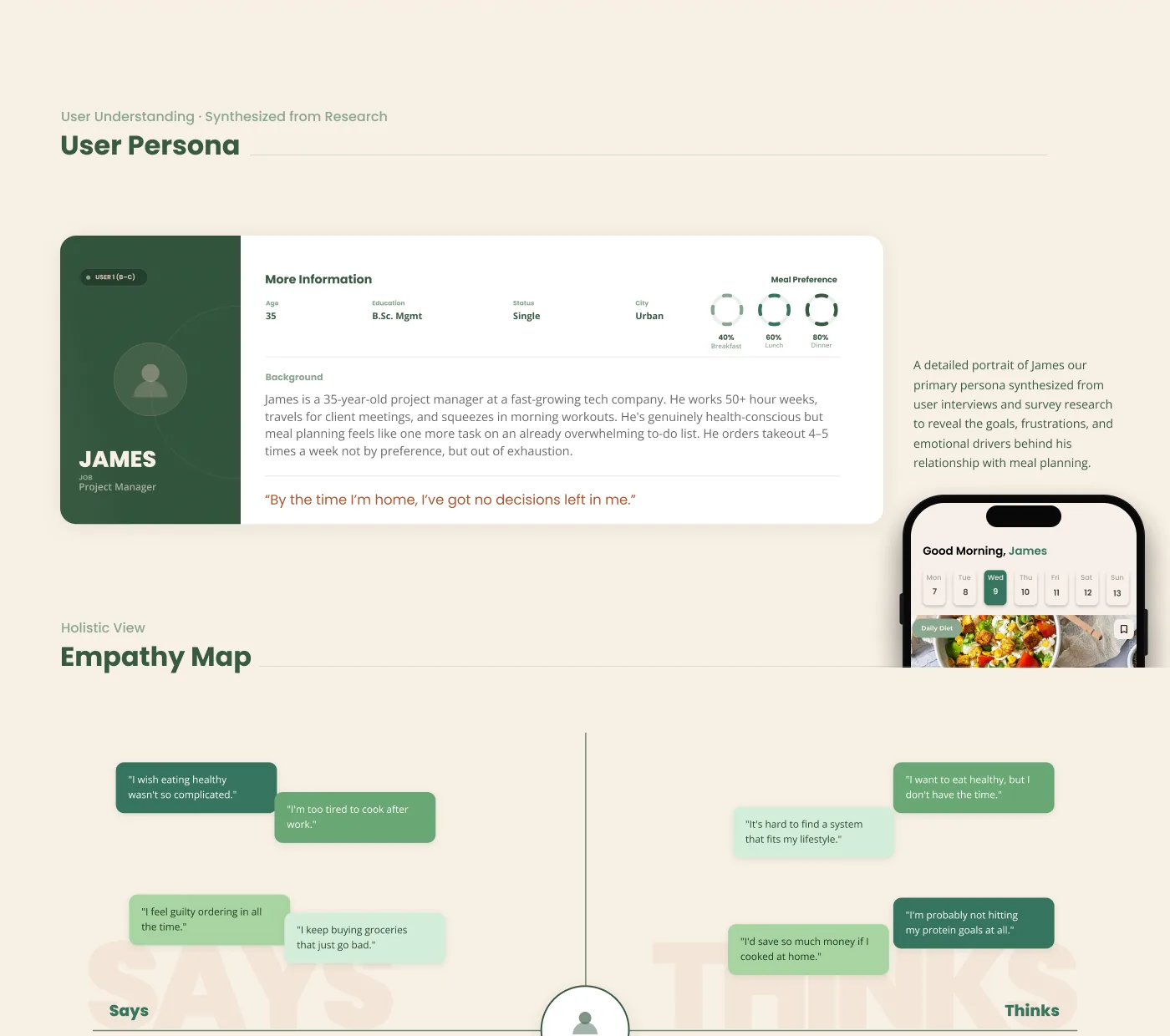
Meal planning fails in the same place every time, and it is not the cooking. Working professionals aged 28 to 45 said it plainly: “I plan on Sunday and I’ve quit by Wednesday”, and “by the time I’m home, I’ve got no decisions left in me.”
Twelve interviews and 140 survey responses pointed at the same cause. People do not lack motivation, they lack time and cognitive space, and the apps they had already tried were widening the gap rather than closing it: “every app gives me recipes, none give me a plan.”
Which makes most of the category the wrong shape. An app that hands you more options at seven in the evening is adding to the exact thing that broke the week.
(Solution)
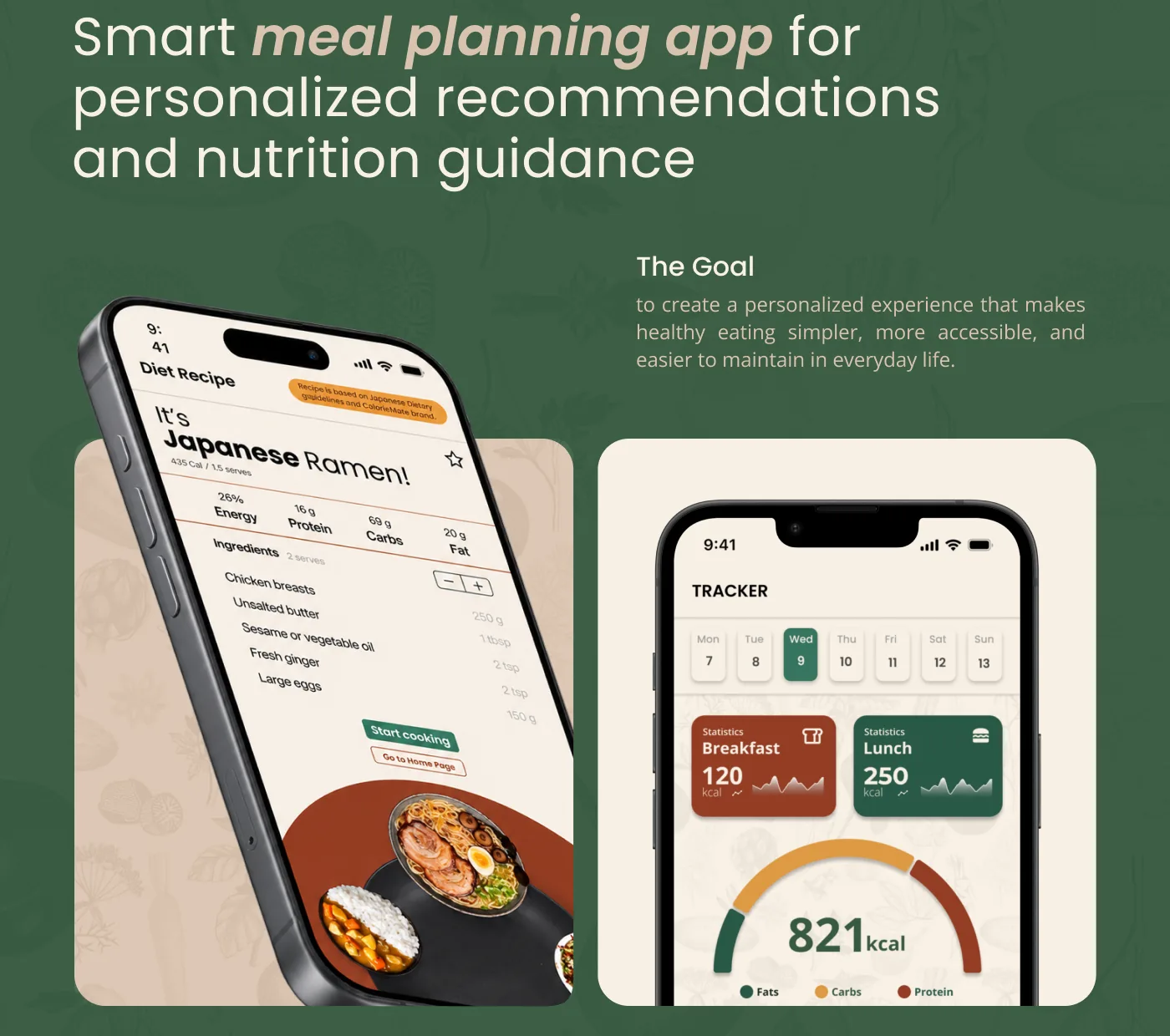
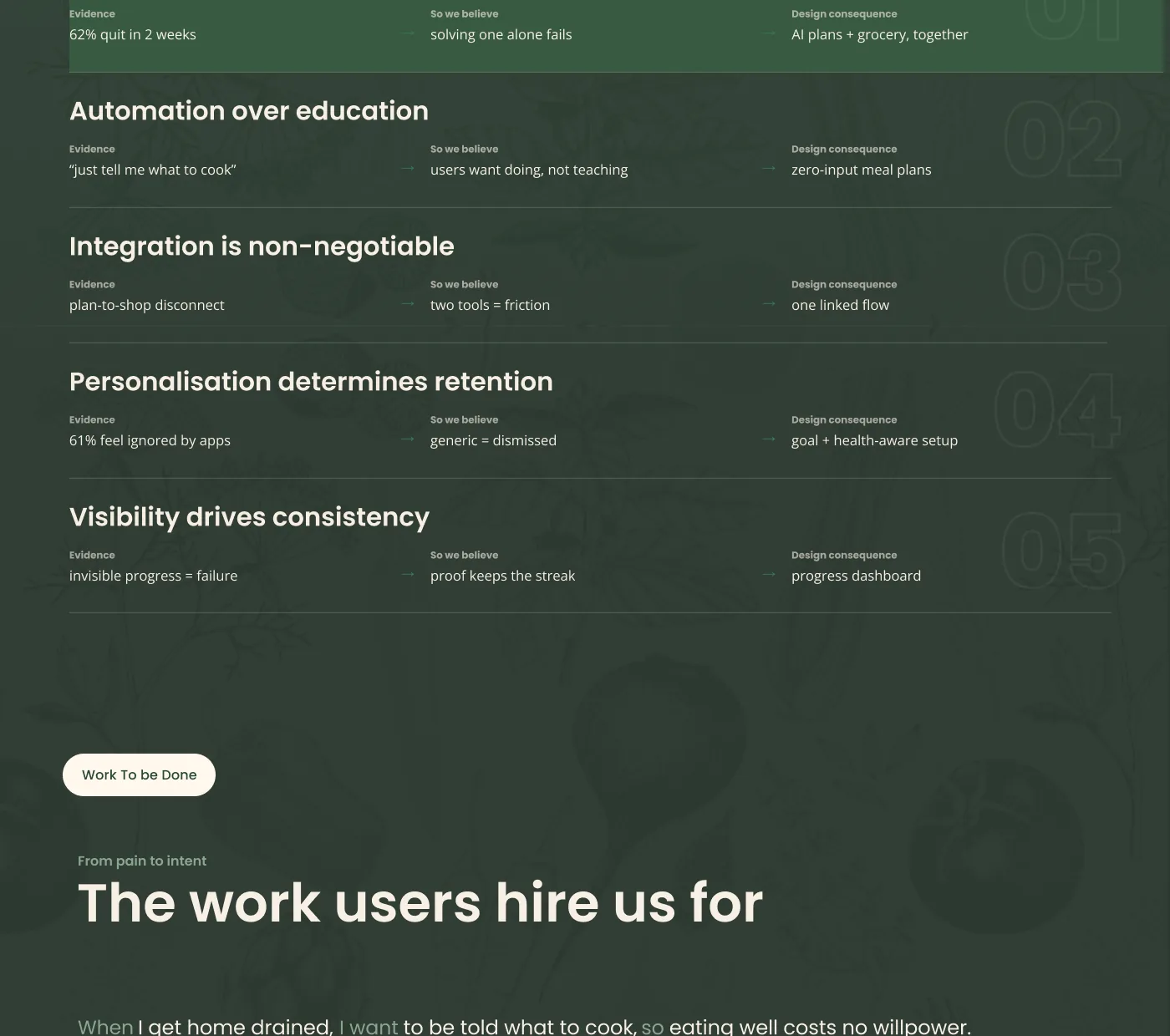
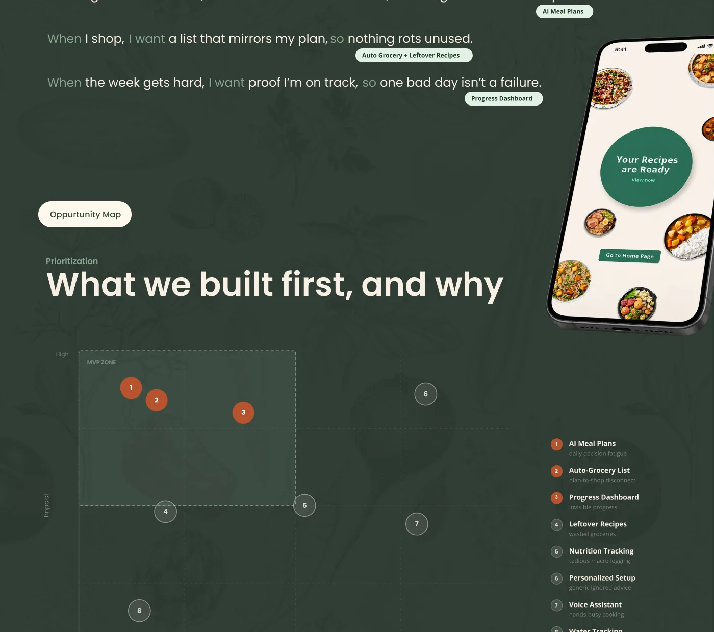
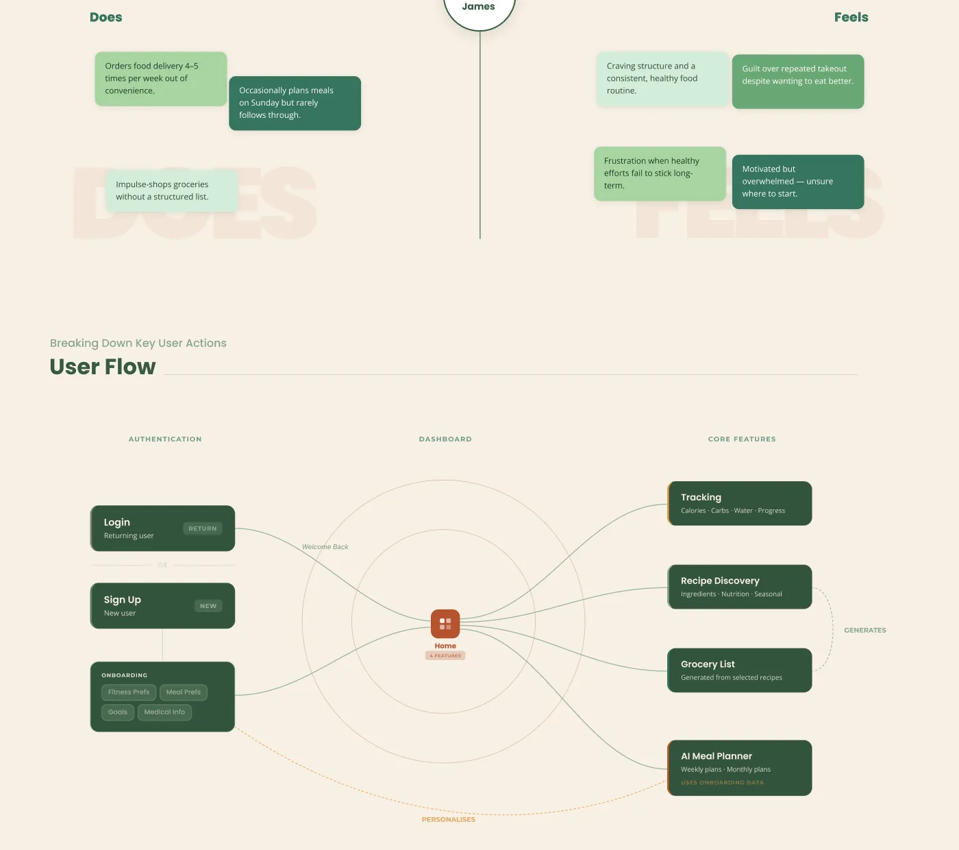
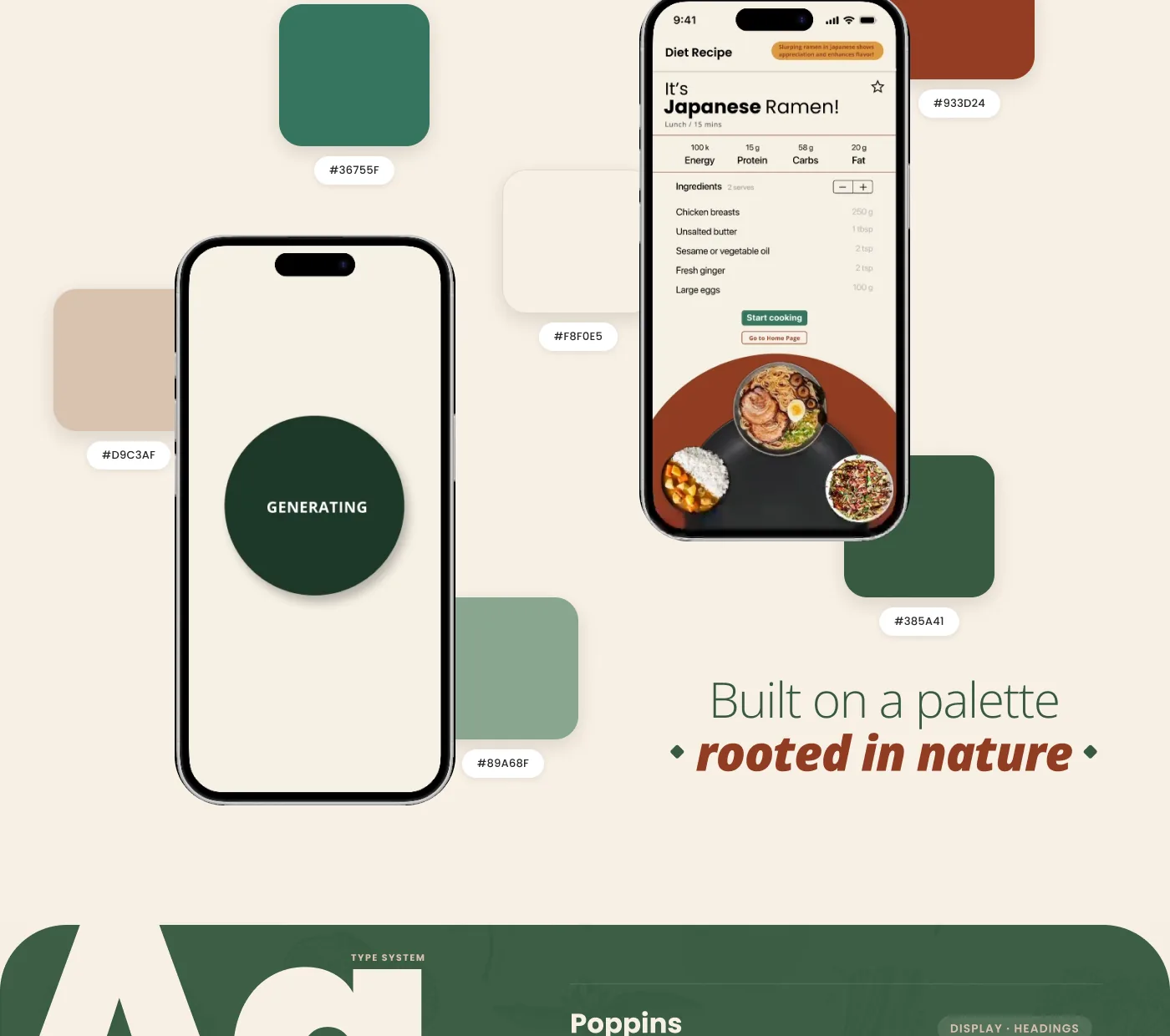
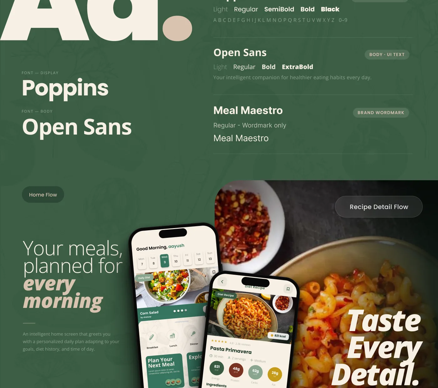
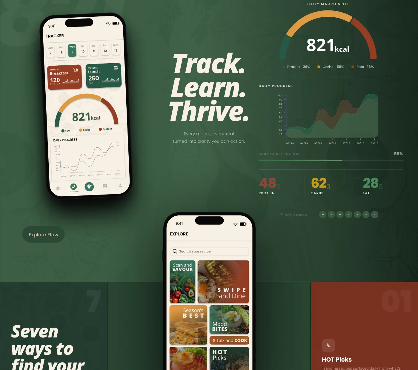
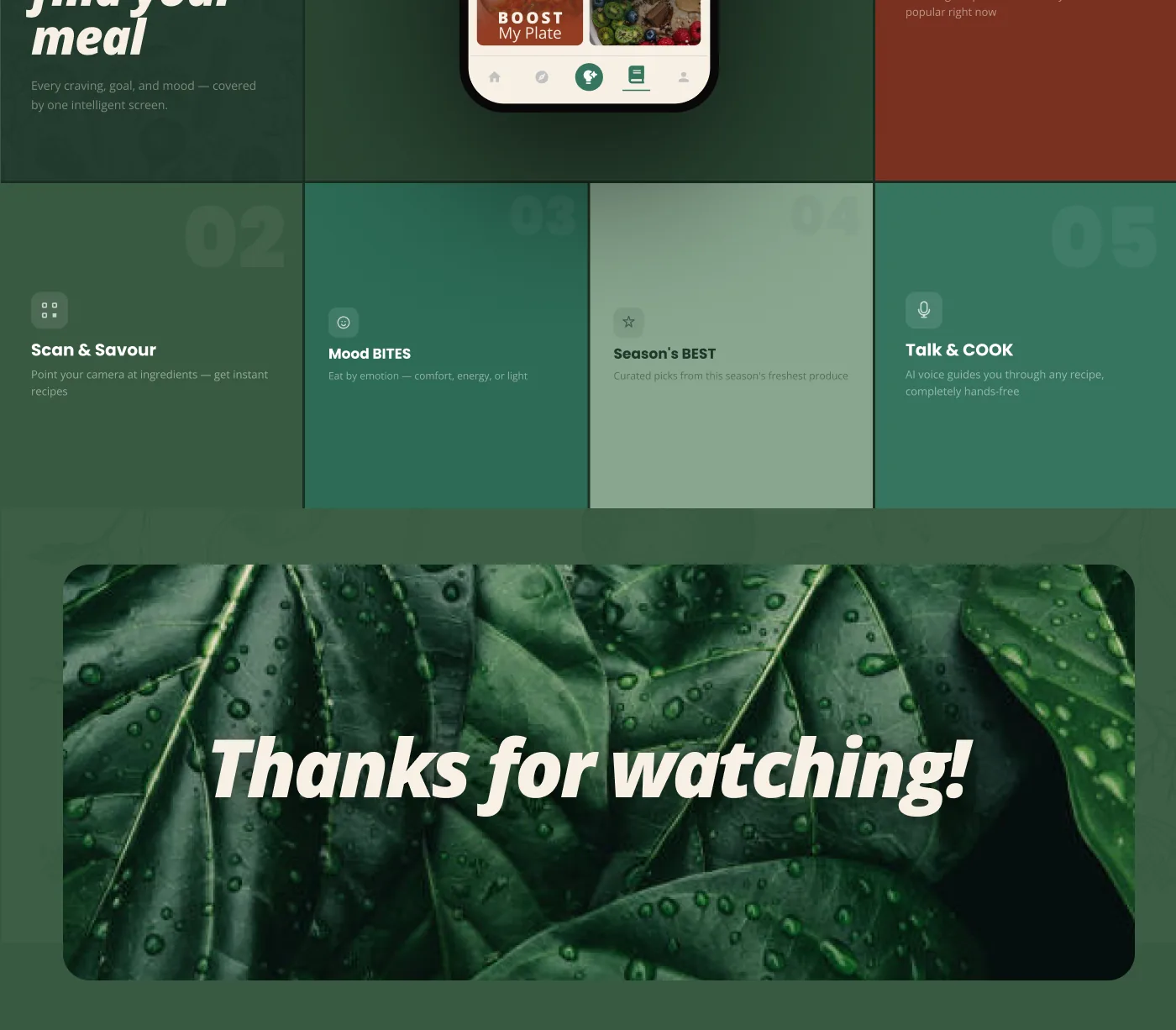
Automation over education. The app does the planning instead of teaching someone to plan. It takes what you like, what you avoid and what is already in your kitchen, and returns a week of recipes with the one grocery list that covers them.
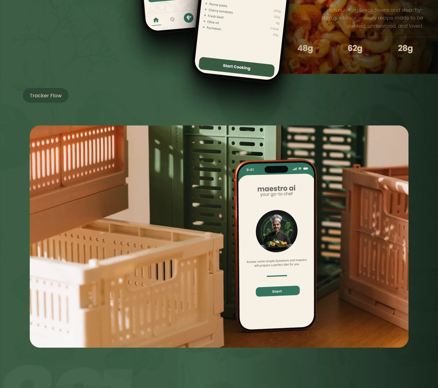
Planning and groceries stay a single flow, because the research was blunt that disconnected tools create friction people refuse to tolerate. Personalisation is the retention mechanism, not a settings screen: generic recommendations were dismissed immediately. A tracker keeps progress visible, so a good week reads as one.
(03)
(The Work)
(04)
(More Work)

Got something in mind?
A job, a project, a wild idea. Whatever it is, drop me a message. Let’s see what we can make out of it.
- Looking for my next opportunity
- Open to freelance work
- Always happy to talk design