

Solo Leveling Website Design
One place to watch it, read it and buy the shirt, for a fandom currently sent to three
- RoleUI Design
- Year2023
- ToolsFigma
(01)
(About)
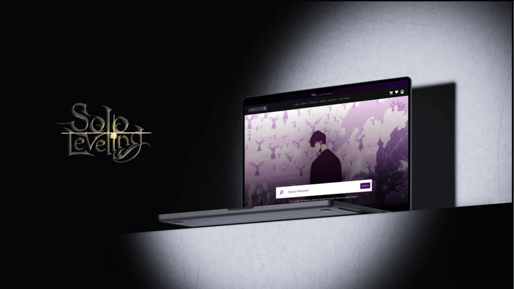
A self-directed UI concept for the anime Solo Leveling: one site that carries the episodes, the manga, the news and the merch, with a video player, a full shop flow and a rating row that routes fans to where the series actually streams rather than pretending to host it.
(02)
(Details)
- Type
- Self-directed concept
- Scope
- Web and mobile UI
- Typeface
- Sora
(Challenge)
A fan of a series like this gets handed around. The episodes are on a streamer, the source is on a manga reader, the merch is on a third site, and nothing owns the whole relationship with the person who cares most.
The art is both the draw and the problem. Solo Leveling's key art is dense, high-contrast and already purple, and an interface laid over it disappears into it.
And it has to be a shop as well as a library. A hoodie needs sizes, a quantity, a wishlist, a bag and a payment route, inside what is otherwise a reading and watching experience.
(Solution)
One nav, six routes. Store, Merch, Updates, News, Ongoing and Upcoming, so the series and the shop sit under the same roof rather than behind different front doors.
Three values and nothing else. #FFFFFF, #130423 and #2B1445. The key art supplies every other colour on the page, and the interface stays out of its way - Sora carries all of the reading, at one weight.
It points outward instead of pretending. The Rating, Stream and Manga row names where the thing actually lives: IMDb and popularity, Prime and Crunchyroll, Mangareader and Solomanga. A fan site that claims to host everything is lying; this one routes.
Commerce as a real flow, not a button. Merch grid, product page with size and quantity, wishlist, bag, shipping address and four payment routes, all in the same dark.
(03)
(The full case study)


(04)
(More Work)

Got something in mind?
A job, a project, a wild idea. Whatever it is, drop me a message. Let’s see what we can make out of it.
- Looking for my next opportunity
- Open to freelance work
- Always happy to talk design